Buildings
Manitoba Building
| Formerly: | St. Paul Fire and Marine Insurance Office |
|---|---|
| Address: | 270 Osborne Street North |
| Use: | Provincial government offices |
| Original Use: | St. Paul Fire and Marine Insurance Office |
| Constructed: | 1953–54 |
| Other Work: | 1990, Exterior alterations |
| Architects: | Moody & Moore |
| Firms: | Moody & Moore |
| Contractors: | Wallace and Aikins Ltd. |
More Information
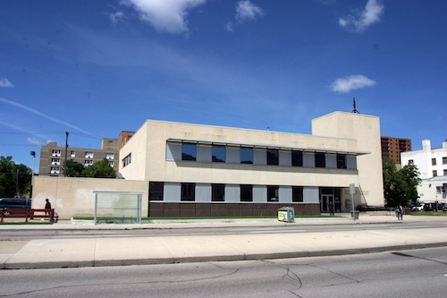
Local architects Moody and Moore designed 270 Osborne Street North in 1953 for a group of insurance firms called the St. Paul Companies, which led to its initial name: the St. Paul Fire and Marine Insurance Building. The building has since been renamed the Manitoba Building and currently houses offices for the provincial government. The original style and interior design drew upon the design of the company's St. Paul headquarters. Employing a modernist approach, the design highlights a clean-lined arrangement of forms and Manitoba Tyndall limestone, echoing the nearby Manitoba Legislative Building and other structures along what was then known colloquially as "The Mall."
The building’s construction was first announced in the spring of 1953, the centenary year of the founding of St. Paul Mutual Insurance Company in St. Paul, Minnesota. Built at a cost of $700,000, the building officially opened December 31, 1954. The structure's initial total area was 22,600 square feet, of which 15,000 was used for office space. Beyond the office facilities, a number of other spaces were included in the original design, including a basement lunchroom which sat 60 and an employee lounge which sat 45. The interior of the building was innovative, embracing an open-concept approach which "Designed for belter employee-management relations" put "executives right out in the open with the rest of the staff." 270 Osborne Street North was built to accommodate extension of up to six storeys above the original two.
Design Characteristics
- Employing their signature smooth-faced limestone with a band of brown polished granite at grade, the architects planned this building with the possibility of a future addition
- The main two storey body of the building originally had a broad sweep of windows and a low wall jutting out from the south end towards an open parking port
- In its current state, approximately half of the original east facing windows have been removed and filled with white cladding. Instead of the original dramatic glazing, the building now has a gap-toothed and washed out appearance, and lacks the lively play of contrasting bands of colour between windows and stone

