The Garrick Hotel
| Former Names: |
|
|---|---|
| Address: | 287 Garry Street |
| Current Use: | Hotel |
| Original Use: | Hotel |
| Constructed: | 1906–1907 |
| Other Work: | 1913, 1928, 1939, 1973, 1978, 1989, and 2001 |
| Architects: |
|
| Contractors: |
|
More Information
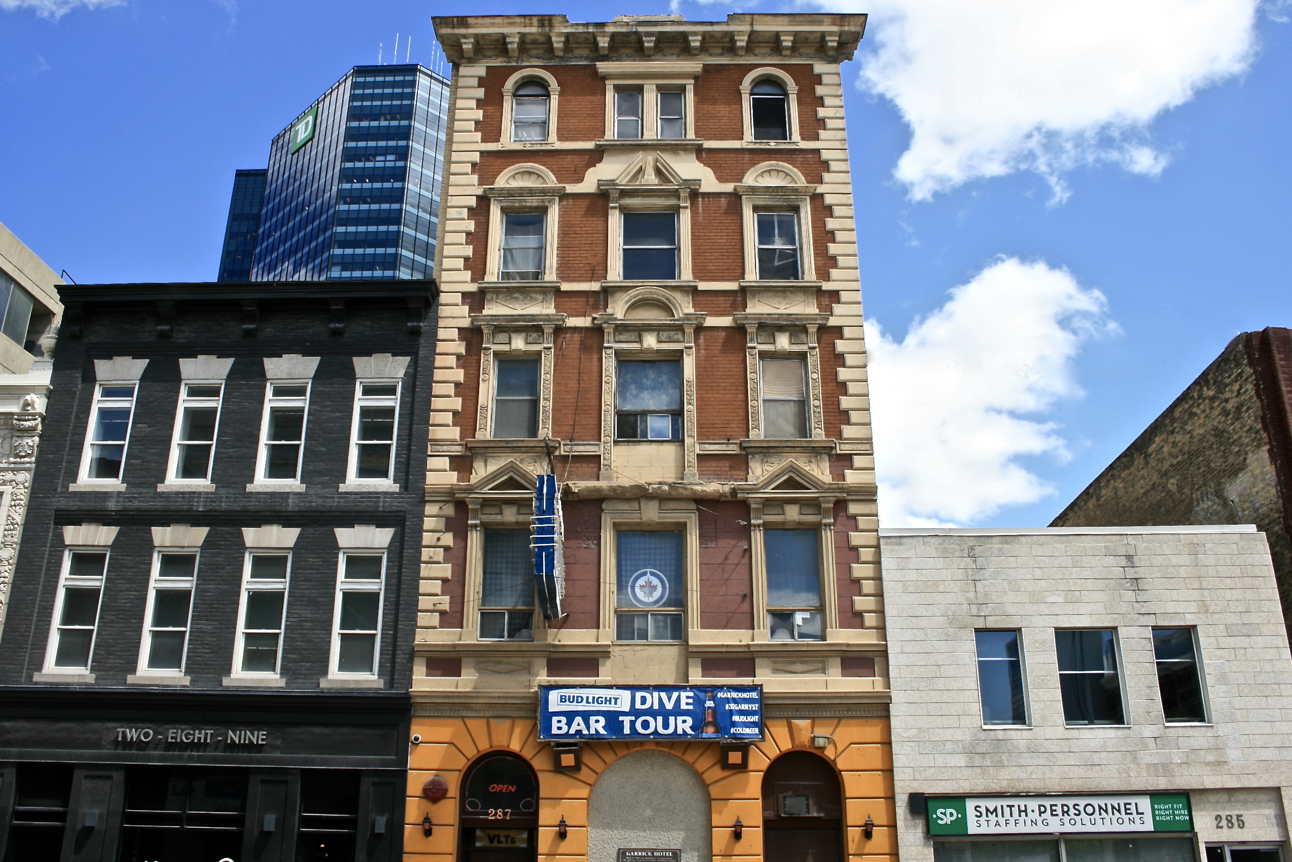
287 Garry Street was constructed between 1906 – 1907 by the Western Cooperative Construction Co. and designed by Daniel Smith and William Bruce. The building was constructed at five storeys tall and initially opened as The Wellington Hotel.
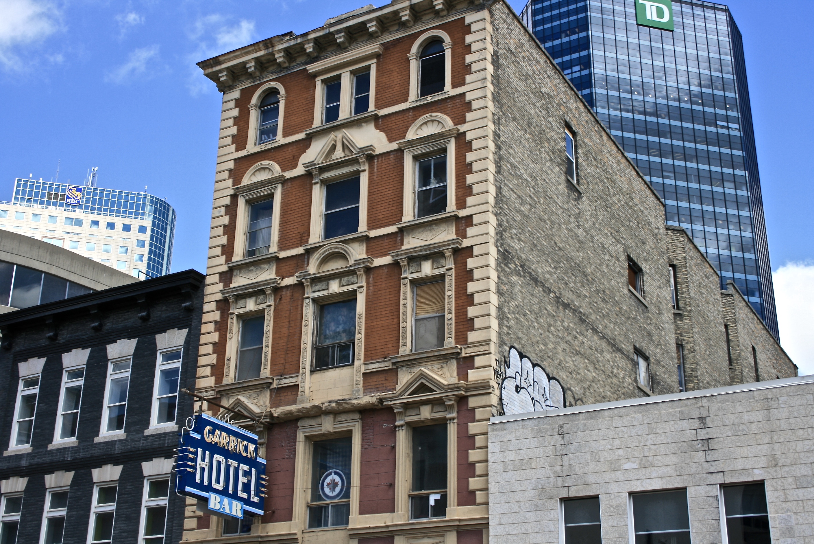
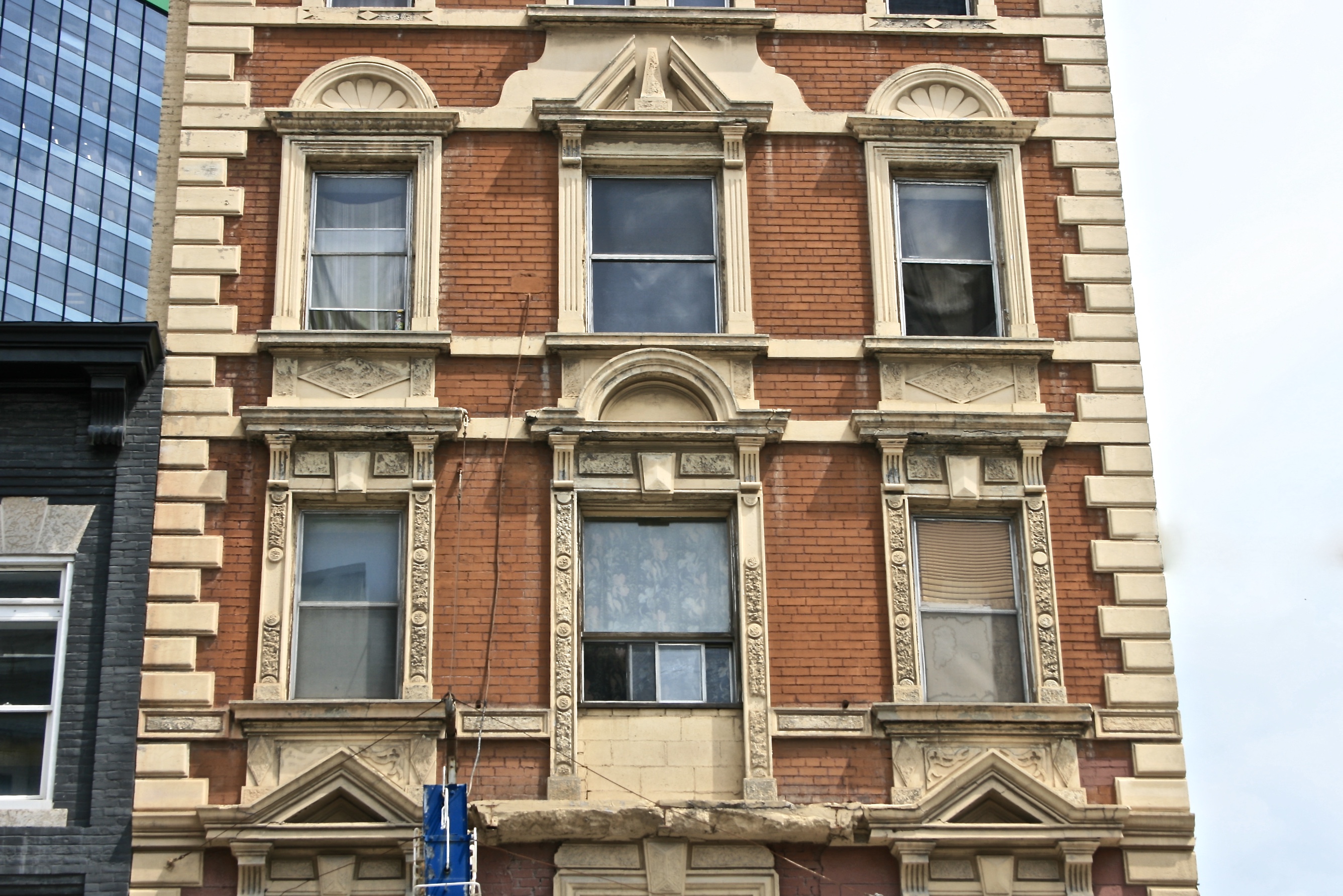
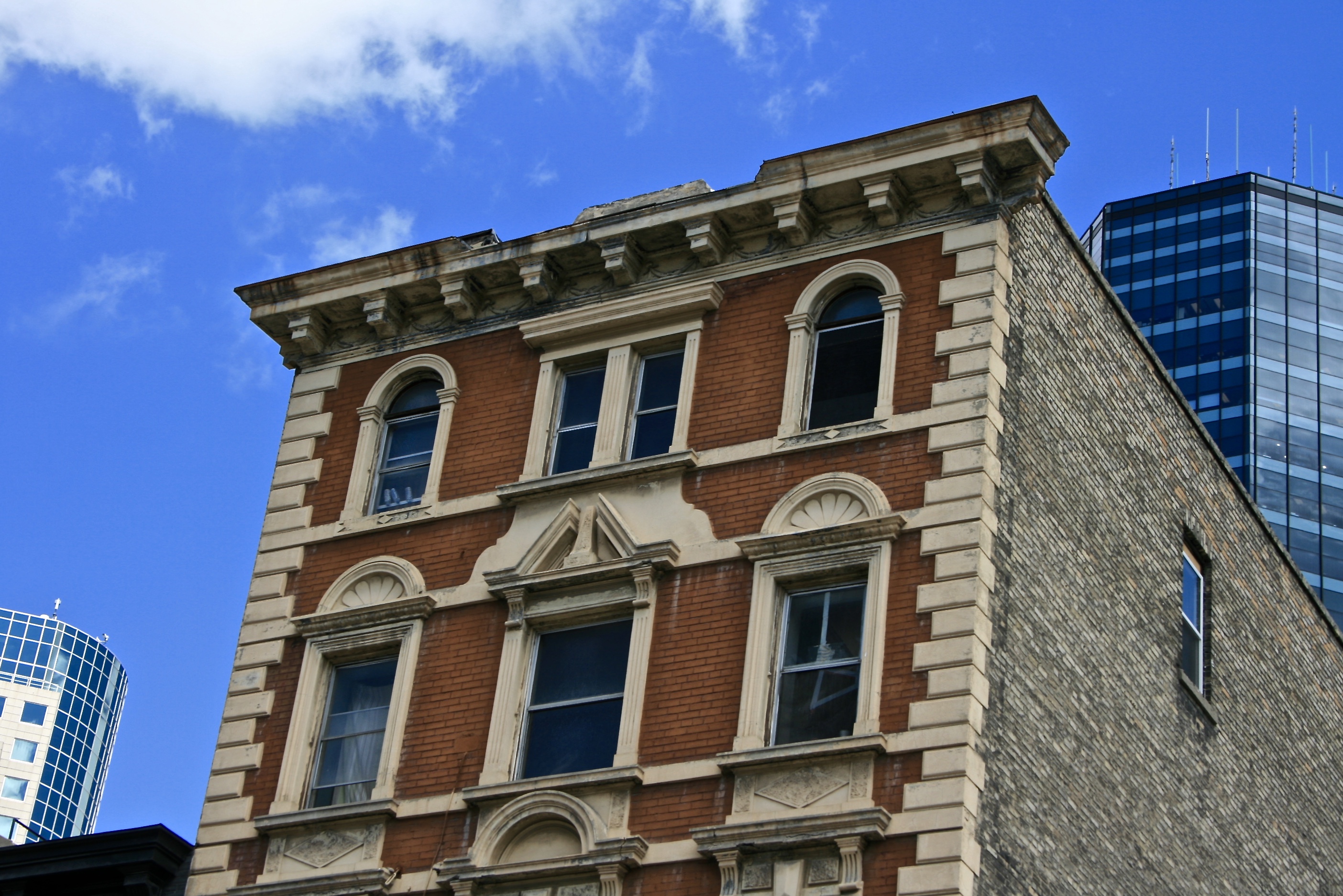
The five storey building was made of a rust coloured brick and stone accents. The building is an example of the Classical Revival Style and is identified by the decorative terra cotta work present on the window frames, quoins, arched and pediment heads, and the entire first floor facade, which has been painted over. Each of the windows had balconies over Garry Street, which were removed in 1978. To the rear of the building is a fire escape, added in 1928, which zig-zags along each floor. The windows and doorways to the fire escape are each arched.
The interior of the hotel was designed with thirty five single apartments which shared communal bathrooms and twelve suites with full bathrooms and sitting rooms. The main entrance to the hotel opened up to rotunda and large dinging room. The second floor had a parlour for the use of the hotel goers. Serving all the five floors of the hotel was an electric elevator.
The Wellington Hotel went through many different hotel owners and by 1922 the hotel was renamed The Garrick Hotel. Interior renovations occurred in the hotel in 1913, 1989, and 2001 while exterior renovations occurred in 1928, 1939, 1973, and 1978. The building continues to operate as The Garrick Hotel. With the closure of the central entrance to the building, the North most door of the facade was opened and is currently used as the hotel’s main entrance.
Design Characteristics
| Materials: | brick, stone, terra cotta |
|---|---|
| Height: | 5 storeys |
| Style: | Classical Revival |
| Neighbourhood: | Downtown |
- Five storey
- Made of brick and stone
- The original design set the entrance to the centre of the building, but recent renovations have blocked the door
- The main level has been painted in a bright yellow while the rest of the building is designed with rusty brick and white stone accents
- Decorative terra cotta work adorns the differently styled windows, quoins, as well as the entire first floor facade
- The building is decorated with a heavy overhanging cornice and parapet


