Roy Sellors, Modernism, and Building Religious Spaces in Postwar Manitoba

Curated by Catherine Acebo
Winnipeg Architecture Foundation

Roy Sellors and Church Design in the Postwar Period

As a prominent architect and professor at the University of Manitoba's Faculty of Architecture, Roy Sellors was instrumental in the development of Winnipeg's architectural landscape. In addition to producing an impressive body of work that includes residential homes and institutional buildings, he designed churches that reflected the rise of modernist architecture and the liturgical movement in the mid-twentieth century.
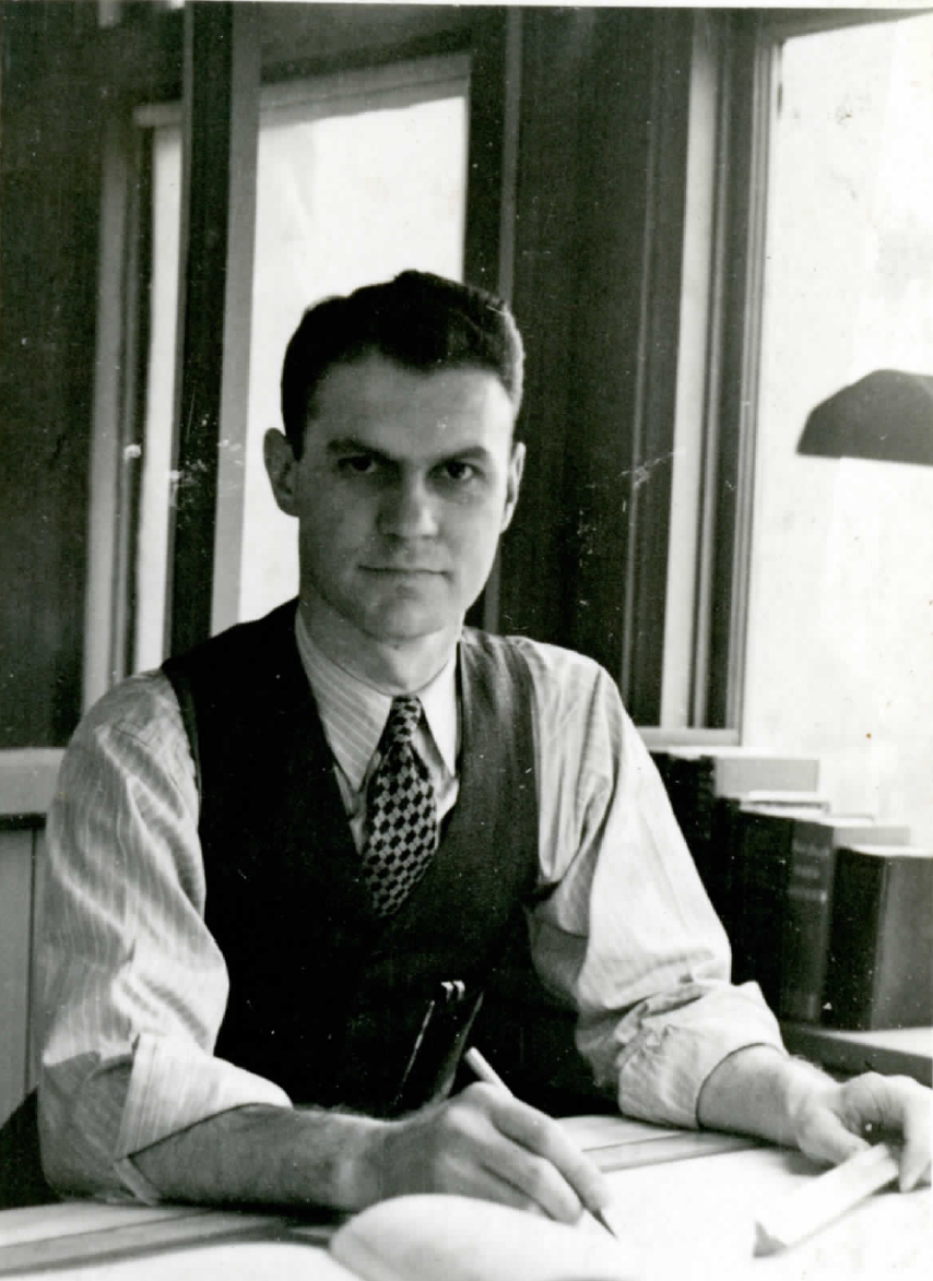
Image shows a man with a vest and a tie. He is sitting at a desk, holding a pencil and smiling slightly at the camera.
Sellors, Roy. Courtesy of the Sellors Family. Refer here for more biographical information about Roy Sellors.

The Liturgical Movement and Modernist Architecture: Building New Catholic Churches

Since it was codified in the sixteenth century, the old liturgy set the parameters for building acceptable churches. Following these parameters, churches were designed with the intention of separating the congregation and the priest. This was done by using long basilica plans, separate chancels, and building altars with rails.

Inspired by theological scholarship about the original and more communal roots of worship, the liturgical movement pushed against the old liturgy's individualism and pursued more engaging expressions of faith. In the new liturgy, the priest faced the nave and communicated directly with the congregation. Whereas parishioners could only come as close as the altar's railing in the old liturgy, the new liturgy invited the congregation to enter the sanctuary to give readings and bring bread and wine to the altar in an offertory procession.

The liturgical movement gained more proponents in the postwar period. Parishes turned to modern architecture for the design of their churches because modern architecture better reflected the changing methods of worship. The liturgical movement's desire to strip away the inessential components of worship echoed the modernist movement's own interest in clear and ordered design.

The Second Vatican Council (1962–1965) addressed the shifting nature of worship and its implications on church design. In 1963, Pope XXIII officially welcomed innovative design and building techniques into sacred spaces. Sellors had already been using modern architecture to design religious buildings that communicated these shifting ideas.

The Impact of the Liturgical Movement in Sellors' Modernist Churches

Sellors designed fourteen churches throughout the 1950s and 1960s. At times, his churches have steep and triangular frames that assert their monumentality as they appear to soar from the ground. In other instances, his churches sweep low across the lot, working harmoniously with the flatness of the prairie landscape. Though the buildings' designs varied and were informed by the interests of their respective parishes, Sellors’s consolidated approach to religious architecture is expressed through precise forms and thoughtful provisions for light. His use of form and light addressed the common interests of modern architecture and the liturgical movement in functionality and simplicity as a pathway to contemporary connection.

The clarity of Sellors’s churches is assured by their streamlined rooflines and minimalist ornamentation. He maintains the same degree of order in the interiors. In lieu of ornate decorations, Sellors constructed gleaming wooden arches that spanned from the narthex to the sanctuary and kept the walls bare. The clean and dynamic lines are further accentuated by the honest representation of construction materials, which mainly comprise of concrete, brick, and finished wood.

Laminated wooden arches are a fixture in Sellors’ designs. His constant use of laminated wood can be traced to the development of new lamination methods. The approach to lamination became more advanced during the Second World War. Such advancements were driven by the need to build lightweight airplane parts that were stronger and could be easily manipulated. In the postwar period, the new lamination methods were used in modern church construction. Architects were attracted to laminated wood’s pliability and price tag. Beyond the practical appeal of the material, laminated wood brought tremendous visual warmth to the space.

Sellors further elevates his religious designs when he experiments with different pathways for light. Some of his churches are illuminated with glass walls fixed at the entrances. Others are flooded with light streaming from clerestory windows that wrap around the structure. The careful placement of windows affirms the churches’ dramatic forms and alleviates the intensity of building materials. The windows also compel visitors to shift their attention towards the sanctuary and upwards to the heavens.

Sellors's church designs are firmly grounded in the traditions of modernist architecture of the postwar period. At the same time, his designs reflect the liturgical movement and the changing attitudes towards worship.
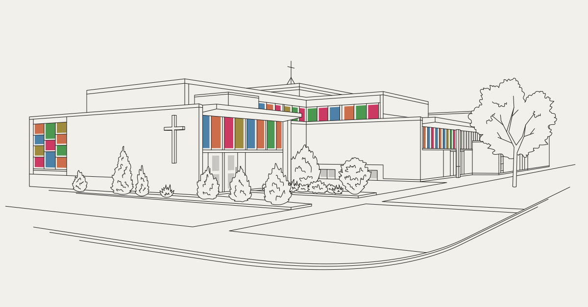
Glossary

Altar: Located in the sanctuary, the altar is a prominent table where the bread and the wine for communion services are consecrated.

Clerestory: Clerestory windows refers to the upper part of a nave and transepts of a church with a row of windows.

Eucharist: The Eucharist (also known as the Holy Communion and the Lord’s Supper) is a sacrament. It is the process of spiritually feeding the participants with the body and blood of Christ through the consumption of bread and wine.

Glulam: Glulam (known as glued laminated timber) refers to an engineered wood beam that is comprised of wooden laminations.

Liturgy: The liturgy is the format that public rituals of worship follow.

Narthex: In early Christian churches, the narthex was the antechamber, porch, or some distinct space in the western entrance. The narthex can refer to the antechamber or large porch of a modern church.

Nave: The nave is the central part of the church building, built to accommodate the congregation. In traditional Western churches the space is rectangular, separated from the chancel by a step or rail and from adjacent aisles by pillars.

Pulpit: The pulpit is a platform in the sanctuary. It is where preachers deliver their sermon.

Predella: The predella is a raised platform or a step where the altar is placed.

Sacrament: A sacrament is a Christian rite that is ordained by Christ. Sacraments include communion and baptism.

Sanctuary: Known as the main area of the church, the sanctuary is the space where the altar is traditionally placed. The Priest, the Deacon, and other ministers perform services in the sanctuary.

Our Lady of Victory Memorial Parish

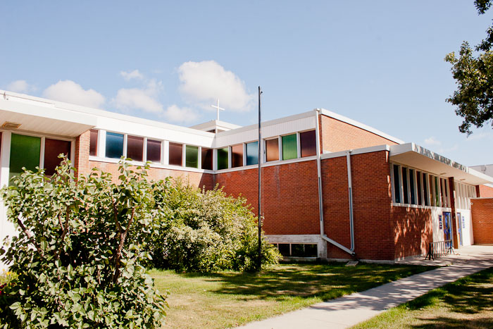
Plans for building Our Lady of Victory Memorial Parish began as early as the summer of 1945. Father J.K. MacIsaac, a well-known community member and veteran, came to a service and announced plans for a new church on Osborne Street. Completed in 1954, the new church was dedicated to the servicemen and women who died in the Second World War.

Image shows the bright red brick exterior of Our Lady of Victory Church. The roofline is flat and accentuated by neat rows of multicoloured windows.
249 Arnold Avenue, Our Lady of Victory Church.
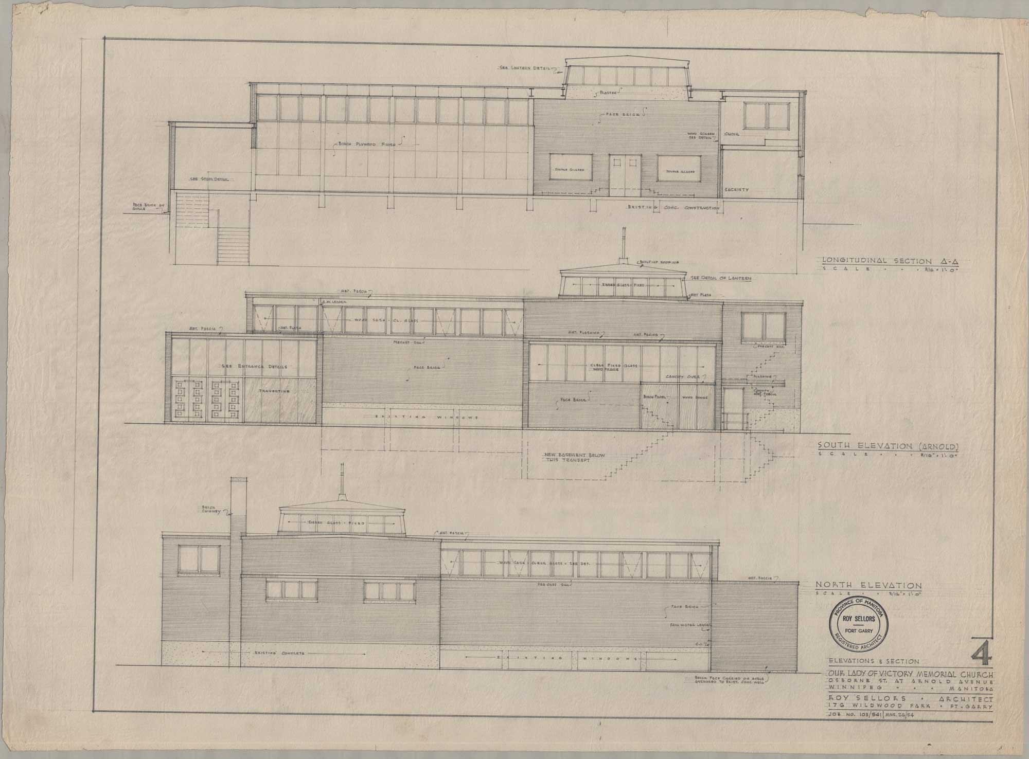
“Longitudinal Section A-A, South Elevation (Arnold), North Elevation (Arnold) (Our Lady of Victory Memorial Church, Osborne St. at Arnold Avenue, Winnipeg, Manitoba, March 26, 1954).” Sheet 4. Roll 103 541 Our Lady of Victory Church.

Though the church is modest in its size, Sellors achieves an element of monumentality with the church’s projecting sections and distinct horizontal profile. Various parts of the building extend throughout the grounds. Its expansive horizontal form is further accentuated by the flat canopies that hang liberally over the entrances and its flat roofline, trimmed with white panelling. Finished with loadbearing brick, it bears no unnecessary embellishments that might disrupt its steady horizontal lines. In place of ornate religious symbols, it pointedly nods to its religious nature with the strategic placement of two minimalist white crosses. A large cross is fixed on the west side. Another cross sits at the centre of the structure, positioned on a rising block. Since the block is surrounded by a stained-glass pane, the wooden cross appears to float over the mass. The elements come together to effectively generate the air of permanence that is traditionally tied to sacredness.

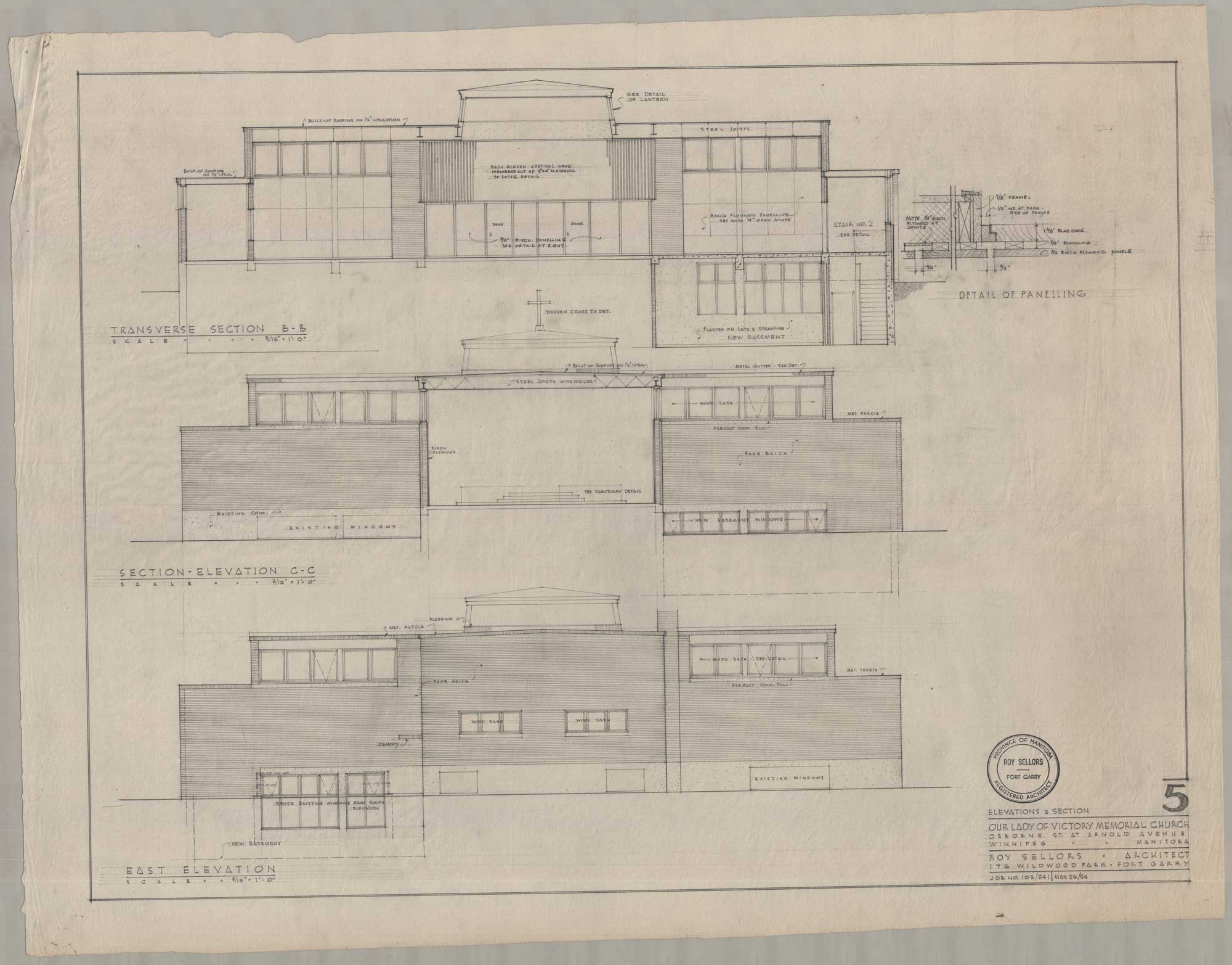
Sellors makes generous provisions for light with the application of stained glass. Colourful clerestory windows run through most of the structure and help balance the heavy brick. On the extending sections of the south elevation, the windows are pulled vertically, taking up as much as half the brick face. The west elevation has a wall of glass, contrasting against the brick. On the centre of the structure, an overhead lantern is wrapped in ribbed glass panels. The repetitive and ordered separation of the windows brightness that alleviates the heavy brick and gently affirms the structure's clarity. The decorative qualities of the coloured glass echo traditional churches’ dramatic appearances, but the minimalism and repetition of the windows places the glass firmly in the modernist tradition. Rather than showcasing detailed biblical scenes, the panels of glass are glazed in alternating shades of red, blue, green, and yellow.

Image shows three sets of elevation drawings for Our Lady of Victory Church. The drawings showcase the windows and the wood panelling.
“Transverse Section B-B, Section – Elevation C-C, East Elevation (Our Lady of Victory Memorial Church, Osborne St. at Arnold Avenue, Winnipeg, Manitoba, March 26, 1954).” Roy Sellors fonds. Sheet 5. Roll 103 541 Our Lady of Victory Church.
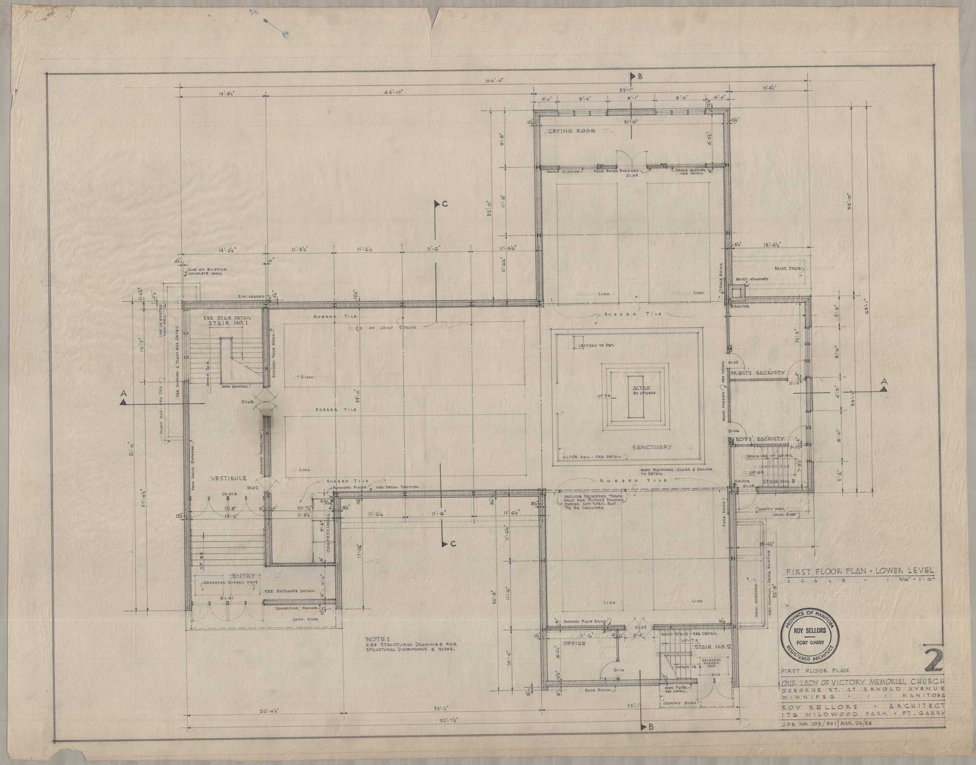
The image shows a drawing of the main floorplan for Our Lady of Victory Church.
“First Floor Plan – Lower Level (Our Lady of Victory Memorial Church, Osborne St. at Arnold Avenue, Winnipeg, Manitoba, March 26, 1954).” Sheet 2. Roll 103 541 Our Lady of Victory Church.

Nodding to long established church plans, Sellors uses a cruciform plan that affirms spiritual hierarchies. The nave extends to the west. Transepts are built on the north and south. The sanctuary and the altar are placed on a raised wooden platform, enclosed by wooden railings. With the directional orientation of the naves and the transepts, the sanctuary and the altar’s distinctive spiritual value is affirmed. The space represents the common spiritual path that parishioners must follow. Though the orientation of key elements follows more traditional expectations, the plan deviates because it frees the sanctuary and places it squarely at the crossing. Since the altar is turned towards the congregation, the priest directly faces the parishioners as they hold mass. The clear attention towards parishioners illustrates the newer and more communal worship practices. By planning the church with an eye towards congregational participation, Sellors reconciles the expectations of older church construction with the practices of the liturgical movement.

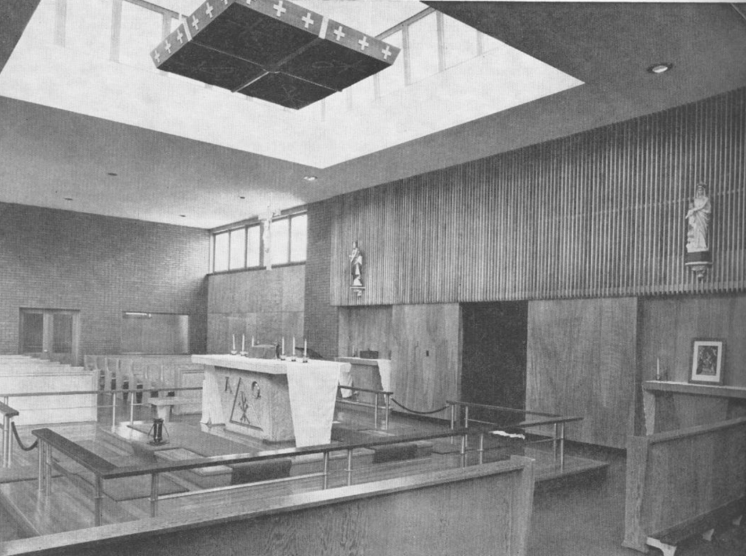
In the process of experimenting with form and light, Sellors signifies the sacred through modernist design. Mirroring the exterior’s horizontal profile, the space uses natural materials and ordered lines to build clarity. The walls are finished with brick and laminated plywood. In particular, the east wall is a striking culmination of order and organic form. Set behind and above the altar, the thin and vertical fins have narrow gaps and shadows that shift in concert with the streaming light. The gleaming birch slats position the contrasting marble altar as a focal point. The organic finish of the walls uses the construction materials’ natural intensity to communicate permanence.

Image shows an archival photograph of the interior for Our Lady of Victory Church. The walls are brick and wood panelled, with a skylight positioned over the altar.
Interior of Our Lady of Victory.
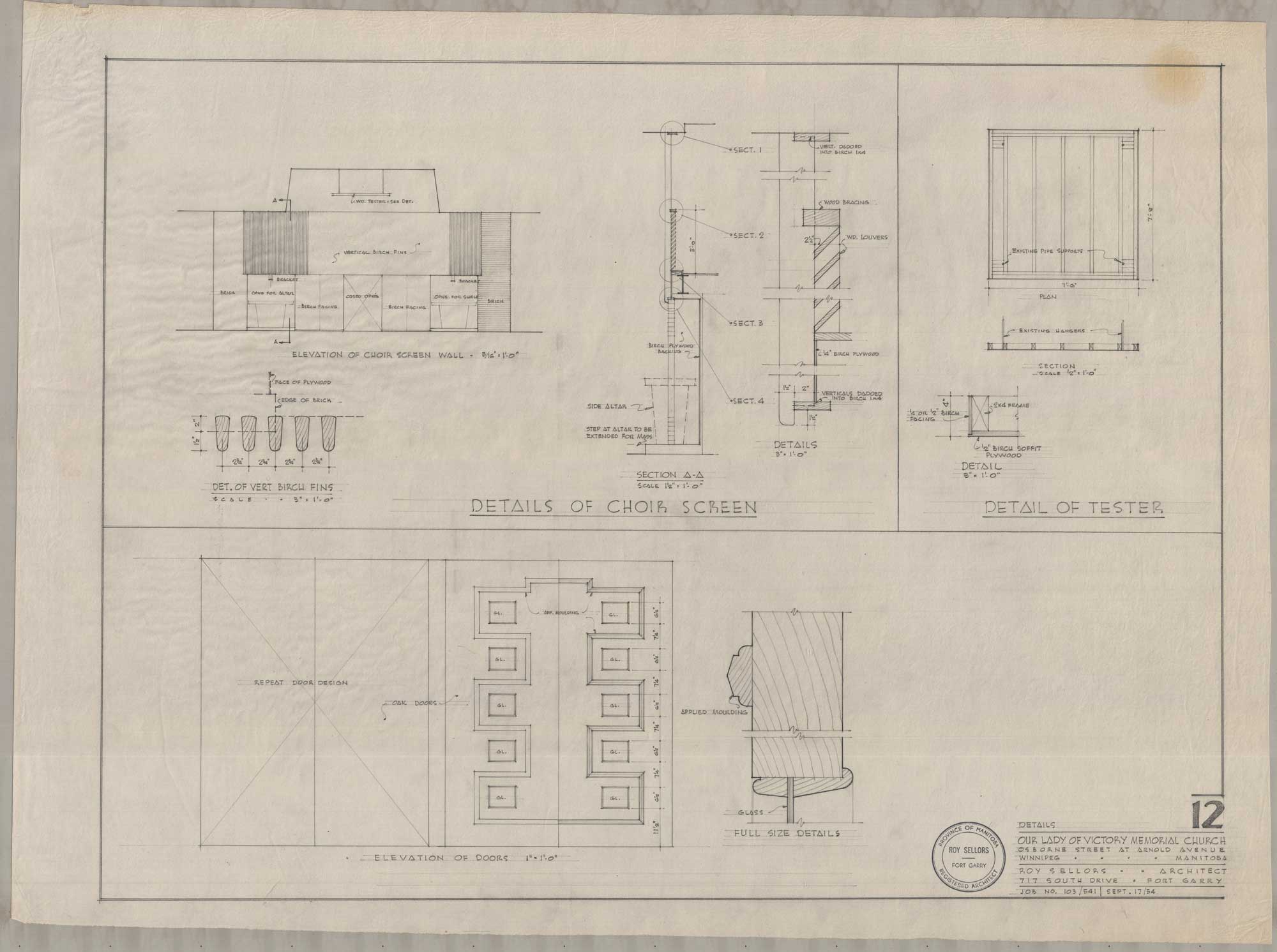
Image shows drawings of choir screen, tester, and doorway for Our Lady of Victory Church.
“Details of Choir Screen – Detail of Tester (Our Lady of Victory Memorial Church, Osborne St. at Arnold Avenue, Winnipeg, Manitoba, September 17, 1954).” Sheet 12. Roll 103 541 Our Lady of Victory Church.

Horizontal lines move continuously throughout the space, uninterrupted by sweeping arches and heavy embellishments. As a nod to religious tradition and to account for the church’s status as a memorial church, provisions for decoration are intentionally made. The Stations of the Cross are showcased on the walls of the nave. A ceiling fixture hanging over the altar is etched with crosses . Mementos from the Second World War are placed on recessed shelves. These additions harmoniously conform to the ordered setting, creating a serene environment that inspires parishioners to fix their attention to religious worship.
Multicoloured light floods the space, working in concert with the simple space to inspire religious serenity. The nave and transepts are lit by the clerestory windows. In contrast to low clear windows that offer a complete view of the scenes inside, the high placement of the windows offers security and mystery. Light floats gently from the high windows, generously relieving the brick and wooden mass. At the same time, light guides the parishioners and affirms the altar’s hierarchical nature. While the nave and transepts are softly illuminated with light floating from north and south facing windows, the raised sanctuary is comparatively flooded with concealed lighting from above.

St. Vital Roman Catholic Parish Church

The Parish of St. Vital was established in 1860. In the following years, the parish gathered in various buildings to accommodate its growth. Floods in 1896, 1931, and 1950 contributed to their frequent relocation. In the aftermath of their worst flood in 1950, the parish searched for a more permanent location and launched a Building Fund Campaign. They chose Sellors as the architect and the church was built in 1958. His sketches show a continued interest in experimenting with traditional forms and light to create an aura of spirituality.

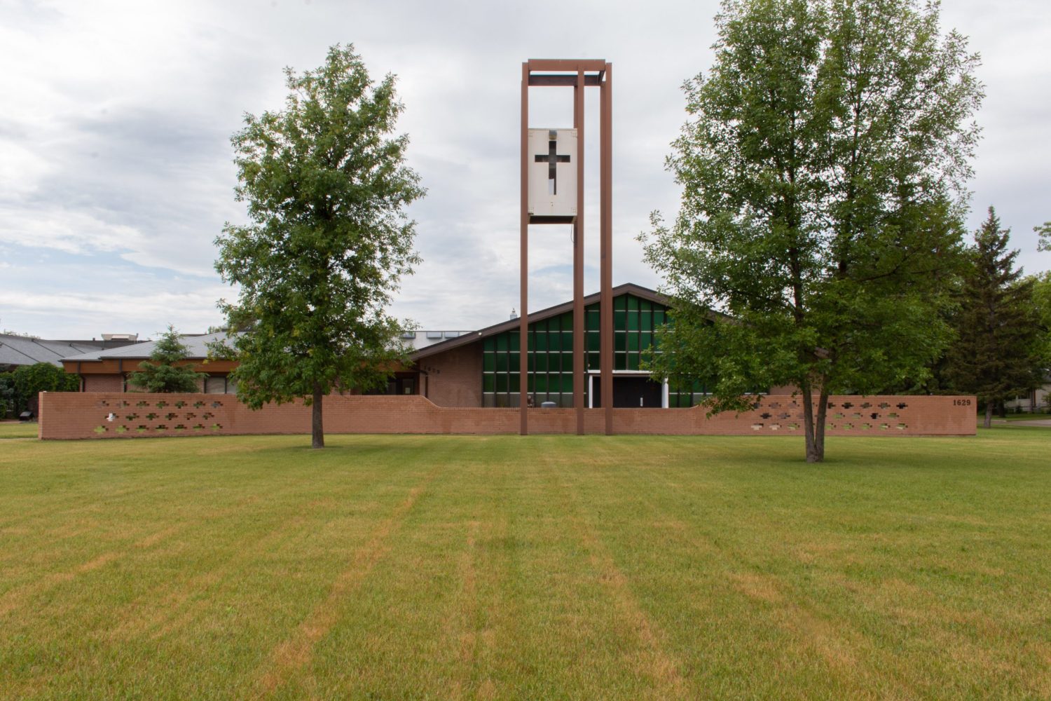
Image shows the exterior of St. Vital Church. A long and brown brick fence spans across the lot, punctuated with cross shaped indentations on the far left and right sides. The building has a dramatic and sloping triangular frame with large glass windows. A cross is carved onto a white and rectangular box, which is suspended on brown beams.
1629 Pembina Highway, St. Vital Roman Catholic Parish Church.

The church has a distinctive roofline that stems from the sloping gable roof stretching across the eastern elevation. The roofline’s gradual and intentional ascent presents the church as a natural extension of the terrain. The complimentary relationship ultimately creates an impression of permanence and continuity. Even as it applies the principles of modernist architecture, it gestures to historical church construction. Like earlier churches, the Trinity is referenced through the triangular frame of the eastern elevation.

Finished with red brick, the exterior is simple and accentuates the structure’s streamlined profile. Ornamentation is sparse. A low, red brick fence with carved crosses sits on the lawn, accentuating the horizontality of the church. A large cross is carved onto a white box and suspended by dark wooden beams. As it towers over the church, it draws attention to the church’s low profile and communicates divine power. The clarity of the design echoes simplified worship practices.

Light acts as a counterbalance against the austere materials of the exterior. As the sloping roofline and brick walls position the space as an organic addition to the landscape, the abundance of glass introduces an extraordinary brightness. The east wall is finished with large and glazed rectangular glass panels that are evenly separated by metal fascia. As the metal extends from the glass, it creates shifting shadows that bring more liveliness and dimension to the otherwise ordered panels. A row of clerestory windows lines the north and south elevations. Meanwhile, a small roof lined with glass panels projects slightly from the northern side of the roof.

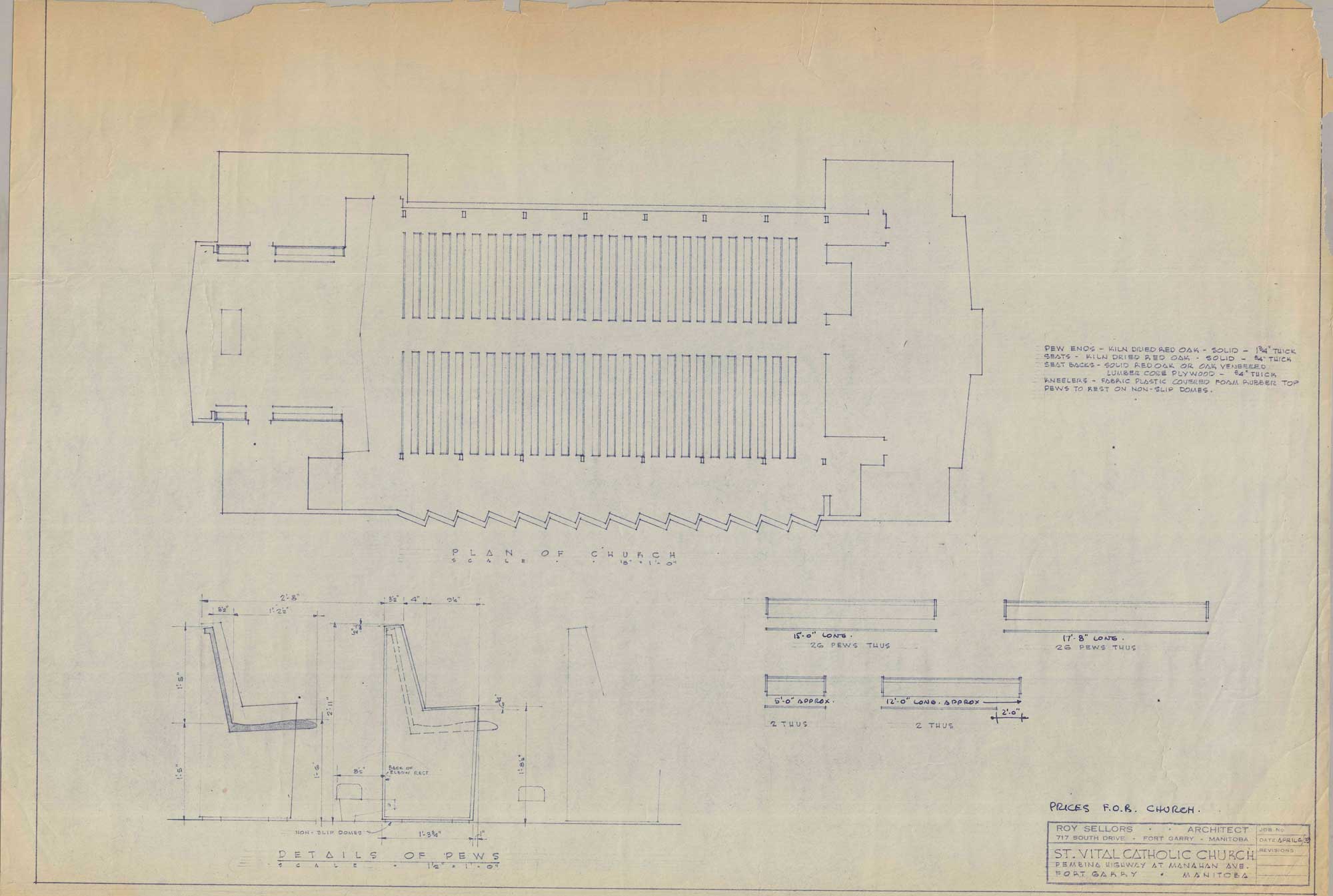
The church has a conventional longitudinal plan. Sellors returns to a more traditional placement of the sanctuary and the altar. Rather than following the liturgical movement’s suggestion of freeing the altar, he positions the altar within a recessed wall and places a rail around the sanctuary. He nods to the shifting religious attitudes by turning the altar towards the parishioners, reflecting an interest in greater congregational participation.

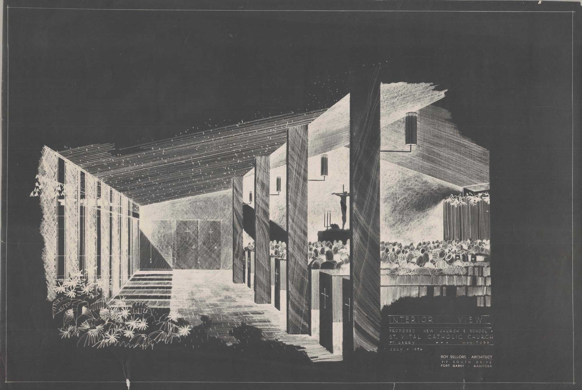
By honestly representing the building materials and making thoughtful modifications to traditional church forms, Sellors continues to articulate religious divinity through modernist design. The walls are finished with wooden panelling, securing feelings of permanence and mass. The laminated wooden arches flow seamlessly with the wood walls as they span from the narthex to the sanctuary’s boundaries. Though it clearly draws inspiration from the dramatic arches of traditional churches, the wooden arches lining the church are defined by their streamlined simplicity. Wood columns rise from the ends of the pews before splitting off into two contrasting lines: one continuing upwards while the other curves. As these lines merge into the ceiling, they reinforce the structural frame of the exterior.

Image shows a black and white drawing of the interior of St. Vital Church. It shows the columns, pews, and the light streaming into the hall.
“Interior View – Proposed New Church and School (St. Vital Catholic Church, Pembina Highway at Manahan Avenue, Fort Garry, Manitoba, August 6, 1959).” Unnumbered. Roll 781 St. Vital Church.
Image shows a drawing of St. Vital Church's main floor plan. On the lower lefthand corner, there are profile sketches of pews.
“Plan of Church – Details of Pews (St. Vital Catholic Church, Pembina Highway at Manahan Avenue, Fort Garry, Manitoba, April 6, 1959).” Unnumbered. Roll 781 St. Vital Church.

The interior mainly concentrates on structural form and materials, but light is strategically employed to accentuate various parts of the hall. The nave is lined with light streaming downward from northern clerestory windows. Meanwhile, light from the western roof and its windows pours into the sanctuary.

Sellors’s placement of the sanctuary and the nave in a recessed and elevated corner of the structure is a classic reproduction of religious hierarchy. A light toned brick wall serves as the backdrop for the altar, while wood panelled walls sit on either side. The sanctuary is framed by light diffusing softly from concealed windows on the side walls. As light flows into the sanctuary, the centrality of the sanctuary is further illustrated.

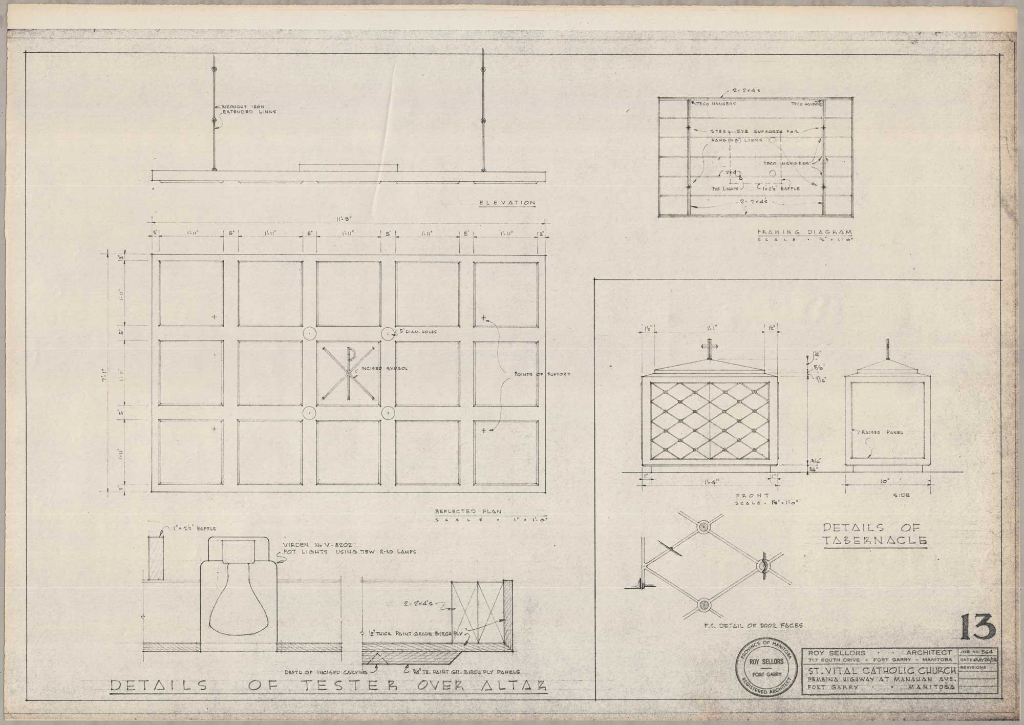
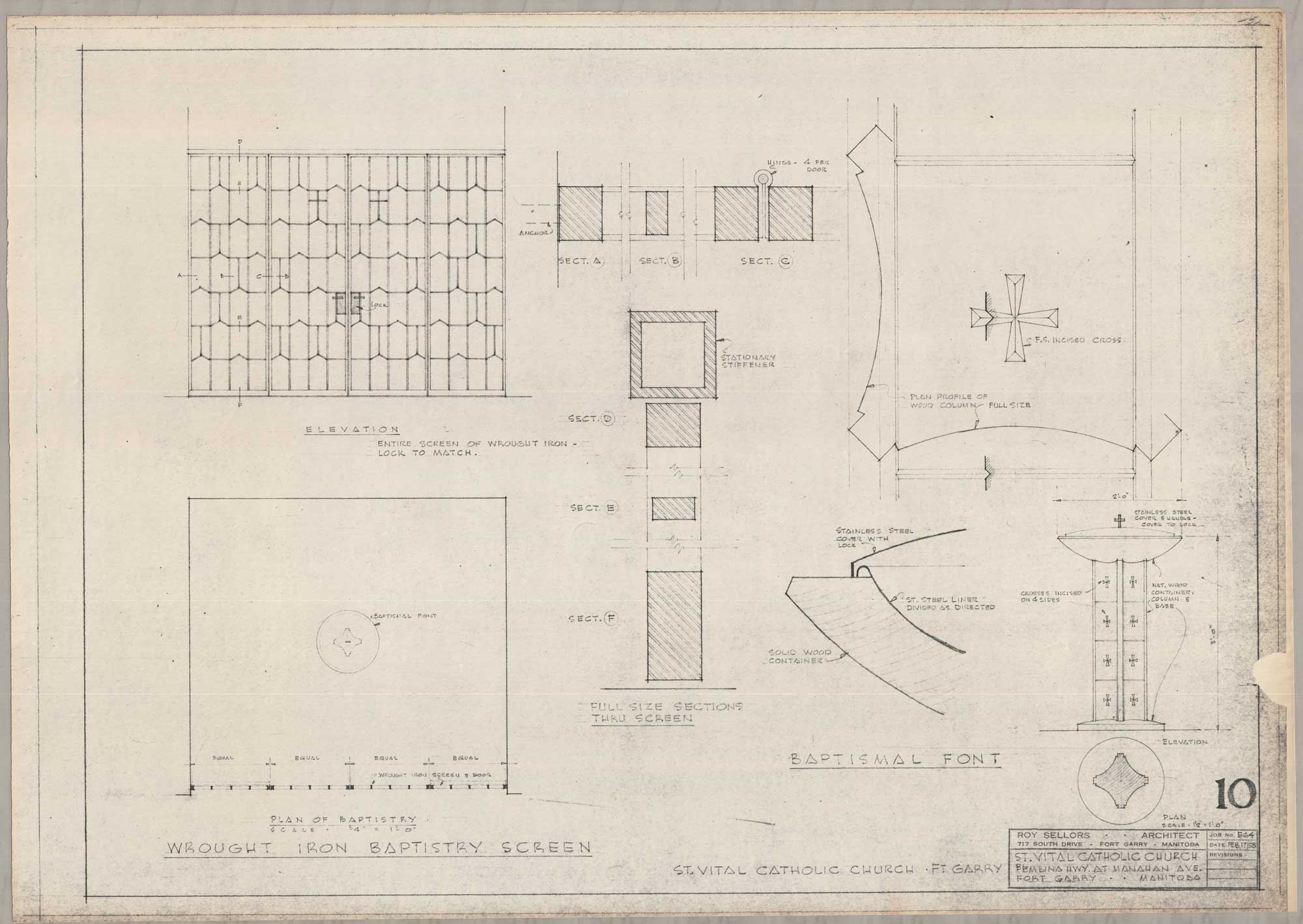
Sellors’s designs extended beyond the structural elements of churches. He designed smaller components as well, such as the baptismal font and the tabernacle. For the baptismal font, he noted details like the incisions on the wood. For the tabernacle, he included details for its face. His attention to other elements of church construction resulted in a cohesive design.

Image shows drawings of the tester over the altar and the details of the tabernacle for St. Vital Church. The sketches are simple, and show the front and sides of the altar and the tabernacle.
“Details of Tester Over Altar – Details of Tabernacle (St. Vital Catholic Church, Pembina Highway at Manahan Avenue, Fort Garry, Manitoba, May 26, 1958).” Sheet 13. Roll 564 St. Vital Church.
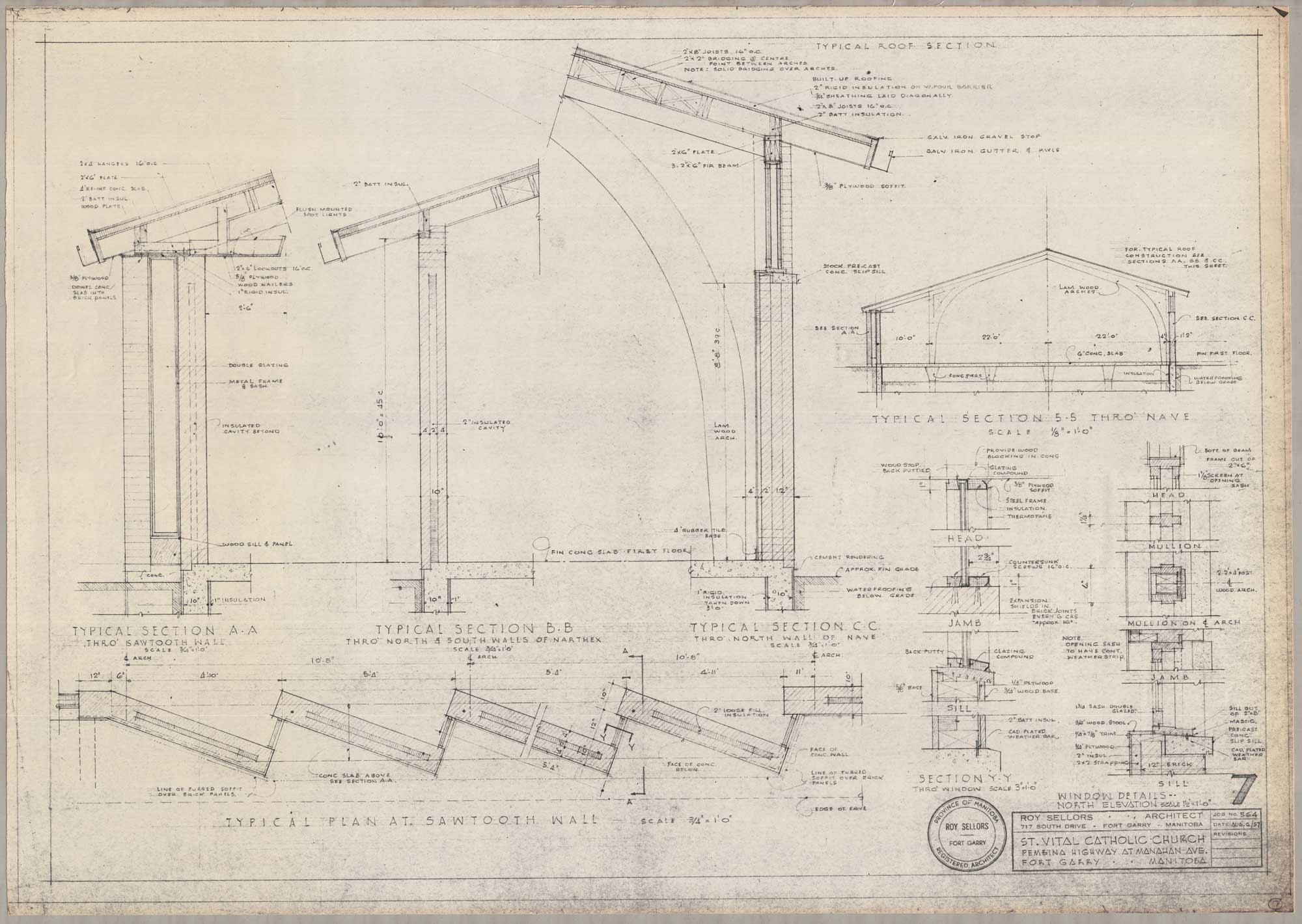
Image shows drawings of the arches over the hall and nave, the sawtooth wall, and window details for St. Vital Church.
“Window Details – North Elevations (St. Vital Catholic Church, Pembina Highway at Manahan Avenue, Fort Garry, Manitoba, August 6, 1959).” Sheet 7. Roll 564 St. Vital Church.
Image shows drawings of the wrought iron baptistry screen and the baptismal font for St. Vital Church.
“Wrought Iron Baptistry Screen – Baptismal Font (St. Vital Catholic Church, Pembina Highway at Manahan Avenue, Fort Garry, Manitoba, February 17, 1958).” Sheet 10. Roll 564 St. Vital Church.

Cornerstone Baptist Church (formerly Beulah Baptist Church and Oakview First Baptist Church)

Cornerstone Baptist Church, formerly Beulah Baptist Church and Oakview First Baptist Church, was built in 1959. While Sellors experiments more liberally with form and light in earlier drawings, the final design is ultimately more reserved.

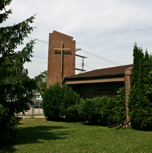
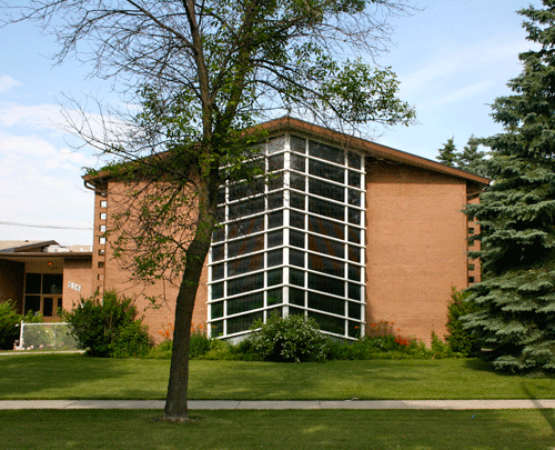
Image shows the exterior of Cornerstone Baptist Church. There is a dark brick column with a cross fixed at the centre.
505 Oakview Avenue, Cornerstone Baptist Church
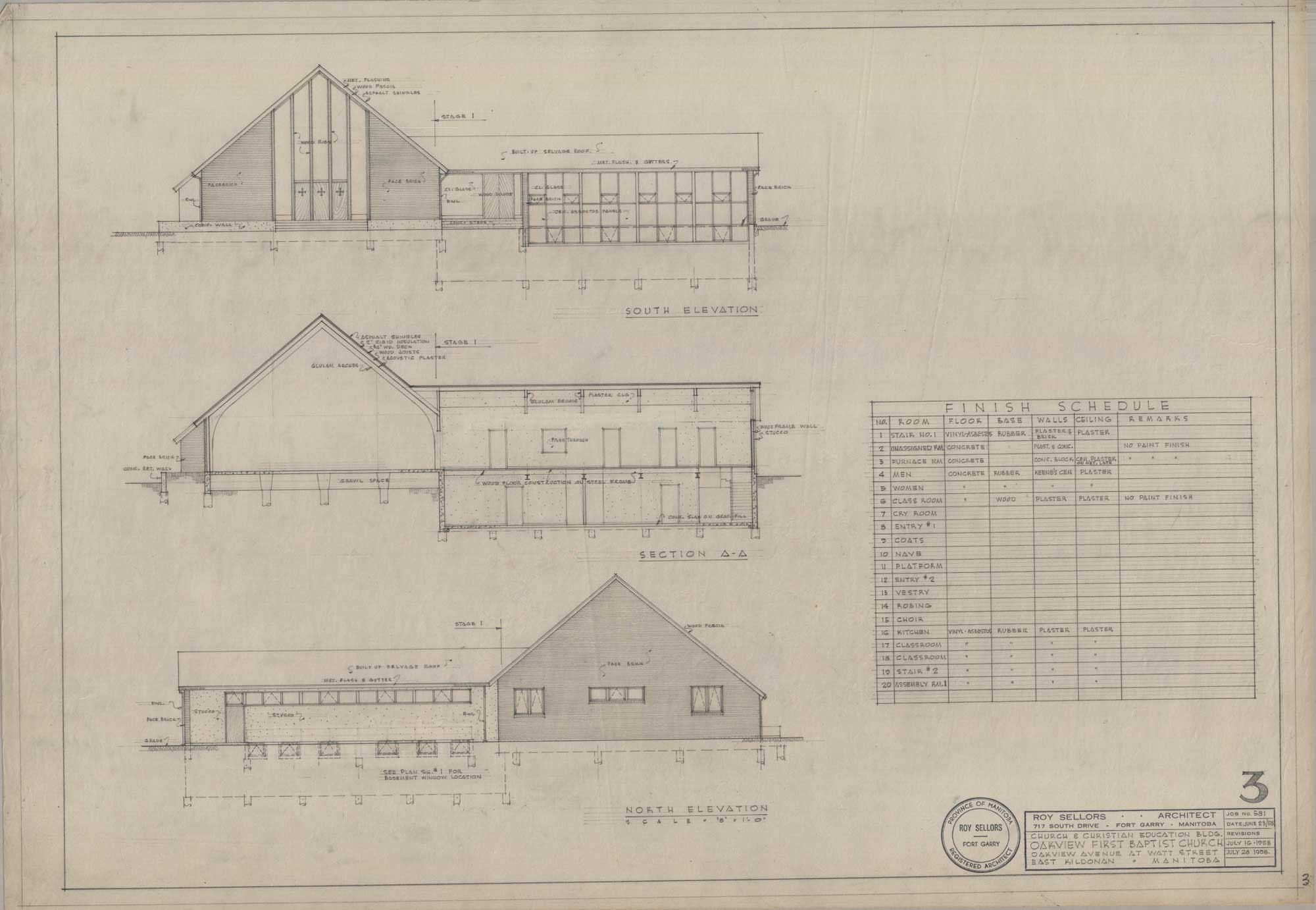
Image shows three drawings of elevations for Cornerstone Baptist Church.
“South Elevation – Section A.A – North Elevation (Church and Christian Education Building, Oakview First Baptist Church, Oakview Avenue at Watt Street, East Kildonan, Manitoba, July 28, 1958).” Sheet 3. Roll 581 Oakview First Baptist Church.

In 1958, Sellors imagined the church with a distinctive and tall gable roof on the south elevation. The roofline's dramatic height was accentuated by floor-to-ceiling glass windows positioned squarely on the centre of the elevation. By calling attention to its height, the tall windows and their uniform wooden ribs brought an impression of monumentality to the modest sized structure. The brick exterior helped affirm the church's mass.

Some aspects of the original design were realised. Construction proceeded with the brown brick face and dark shingles that are outlined in the original sketches. The row of large south facing windows and the narrow sets of windows on the west elevation also followed the earlier drawings.

However, the final design deviates from the initial plans as it cultivates mass with a more restrained and horizontal form. The south elevation went through the greatest number of changes during the design process. Rather than projecting from the windows and squarely facing south, the once triangular entrance is turned to face the intersection. The tall roofline was replaced by a shallow and sloping gable roof that redefines its profile, resulting in a horizontal and low form.

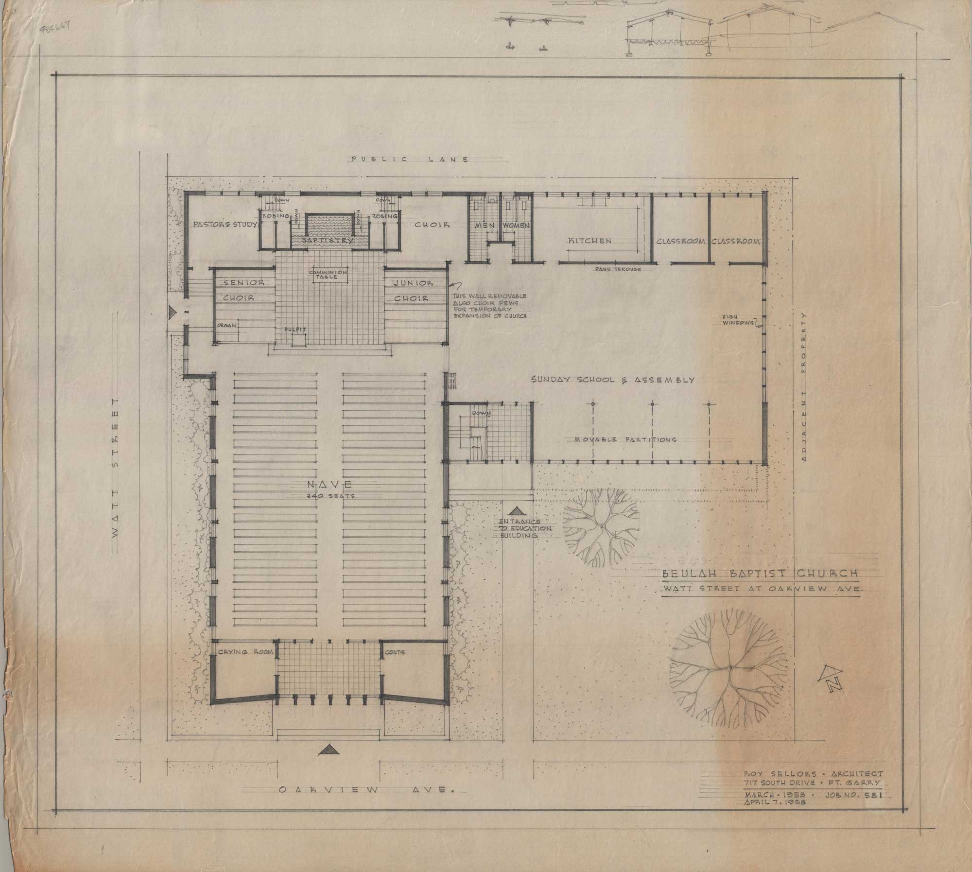
Image shows a drawing of the floorplan for Cornerstone Baptist Church.
“Beulah Baptist Church (Oakview Avenue at Watt Street, East Kildonan, Manitoba, April 7, 1958).” Unnumbered. Roll 581 Oakview First Baptist Church.

Echoes of the earlier plans to accentuate height are seen through the prominent brick tower positioned directly beside the double door entrance. Cut at a dramatic bias, the tower bears a simple wooden cross. In the context of the otherwise reserved building, the tower explicitly communicates the purpose of the structure.

As in his other work, Sellors follows the traditions of early church construction by clearly separating the sanctuary and the altar from the nave. The altar and the sanctuary are recessed and elevated, flanked by spaces for the senior and junior choirs.

St. Joseph the Worker Church

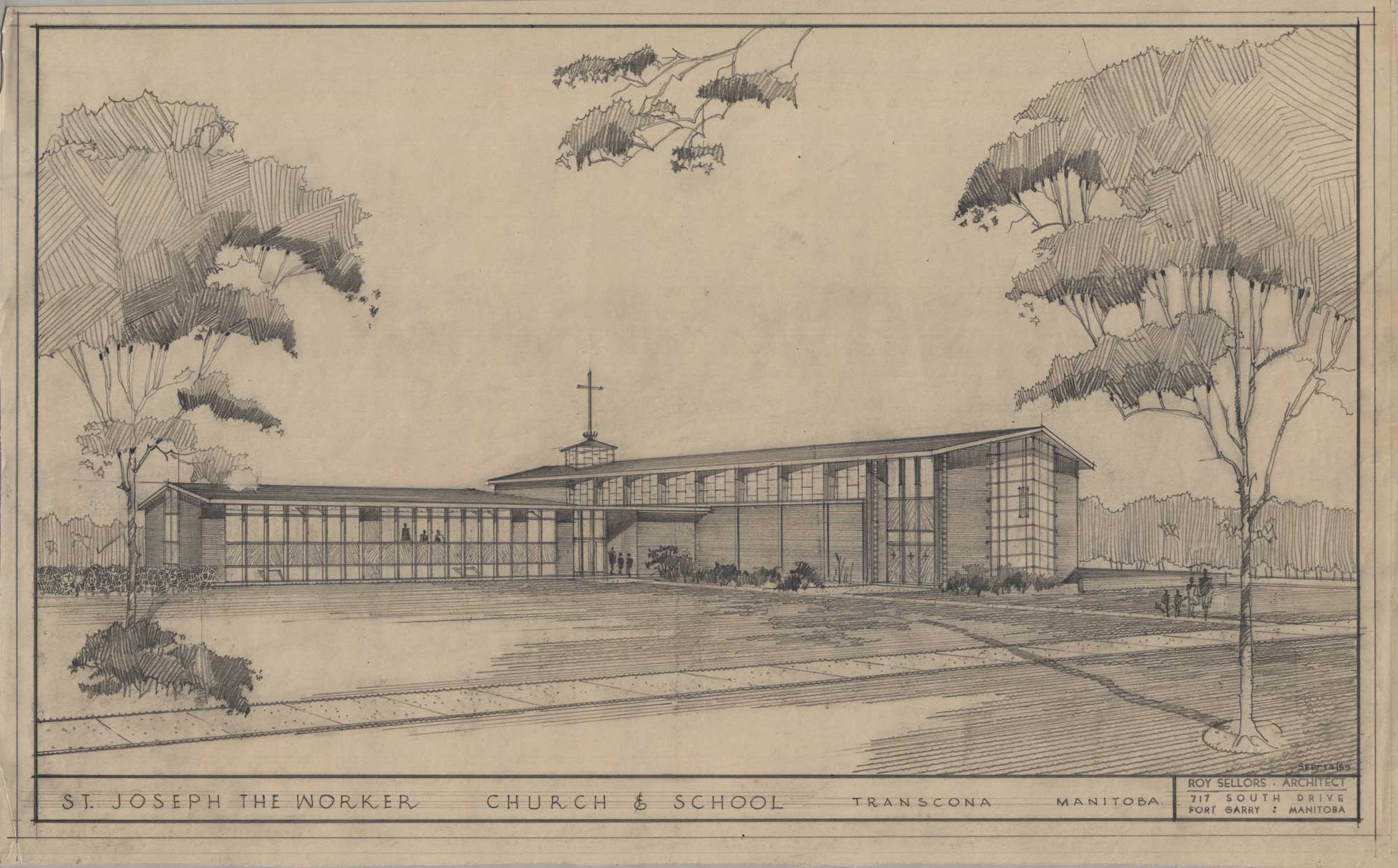
Built in 1960, St. Joseph the Worker Church serves as a church and a school. In its application of geometric forms and light, the church embodies changing approaches to church building while nodding to religious traditions.

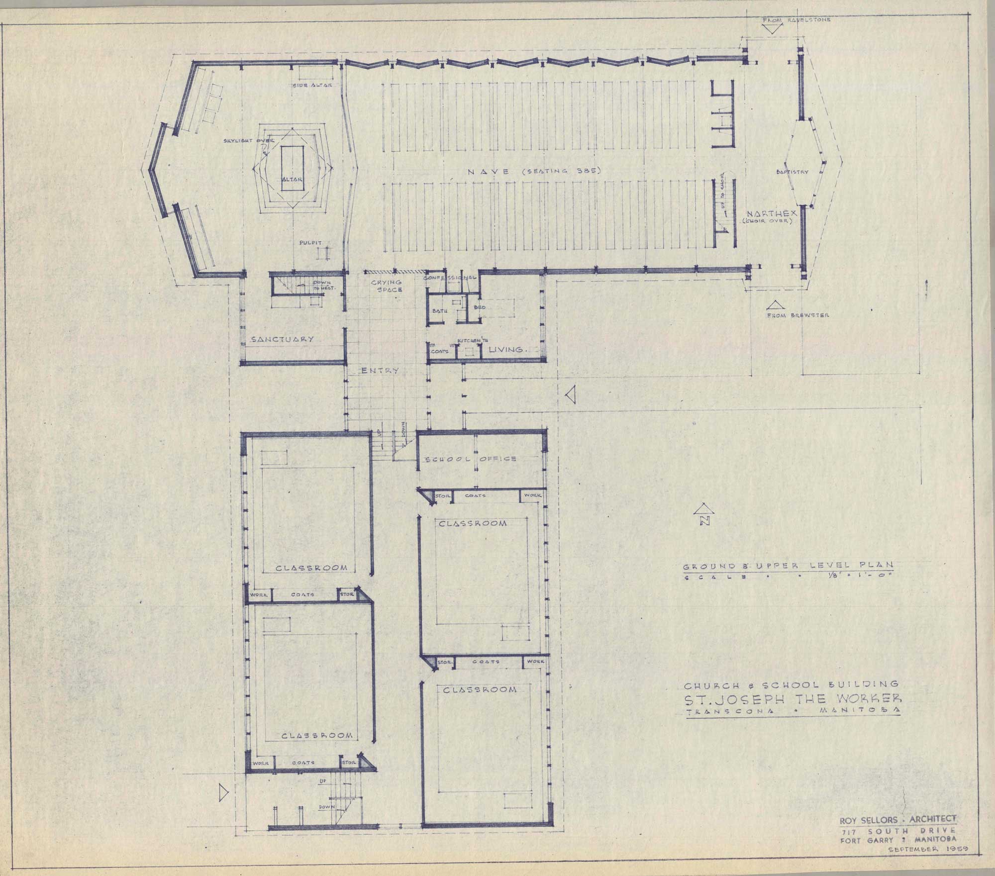
The building accommodates its dual function as a church and school through an L-shape plan. The structure is clad primarily in brick. A block rises slightly from the roof, composed of obscure glass with a metal flash division. A thin white cross is positioned over the windowed block. The church, with its modest gable roof and simple rectangular structures, has a subdued frame. In the absence of a dramatic structural plan, the church bears rich geometric detailing and thoughtful pathways for light.

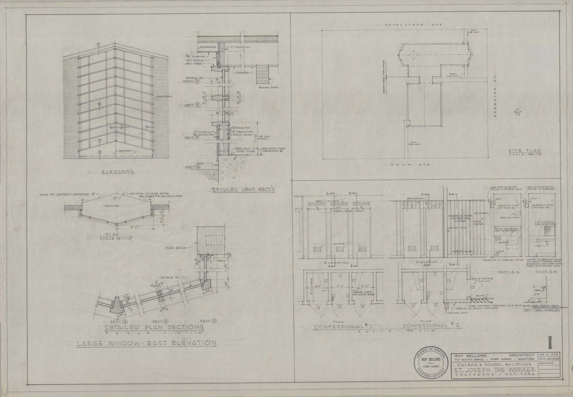
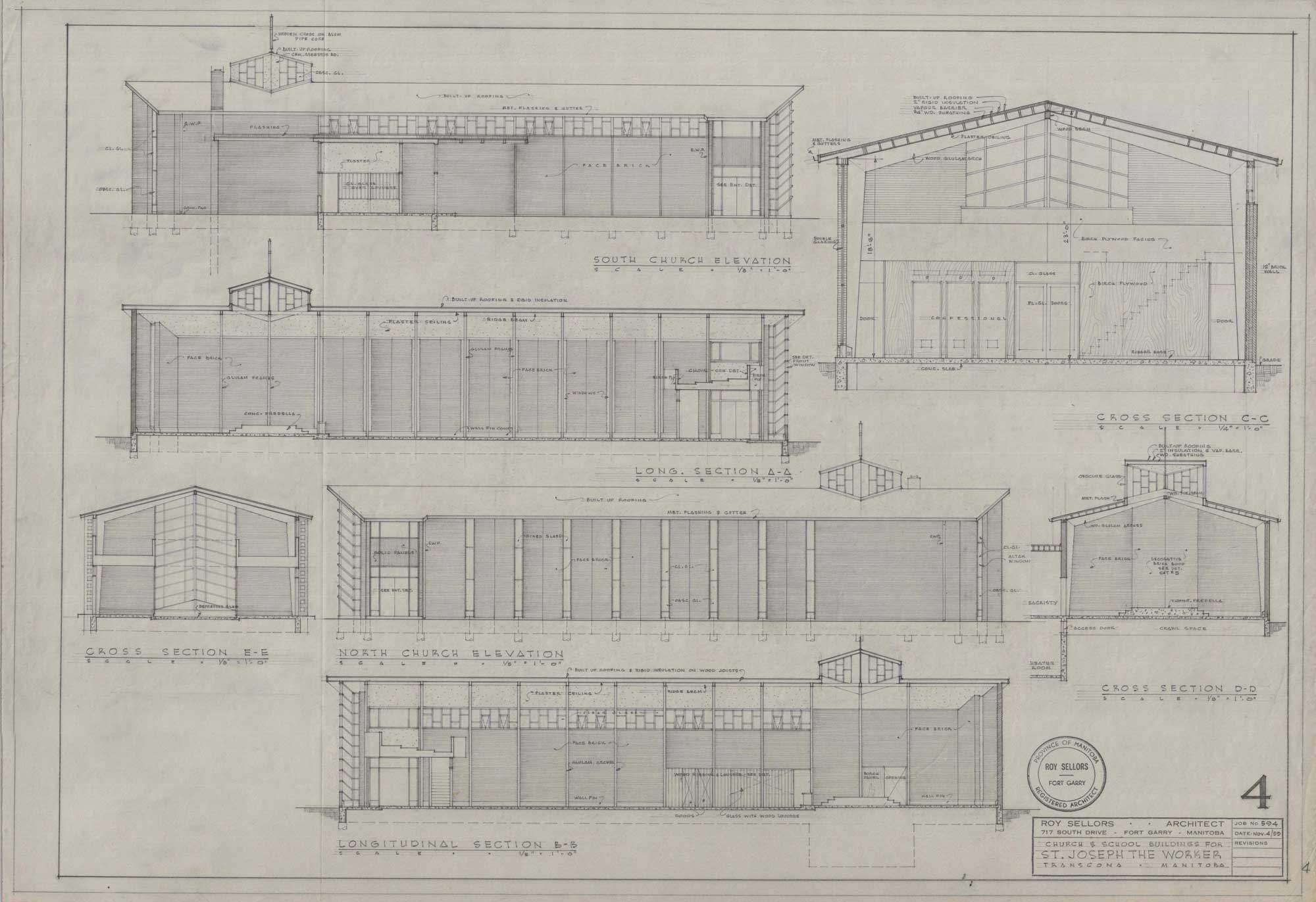
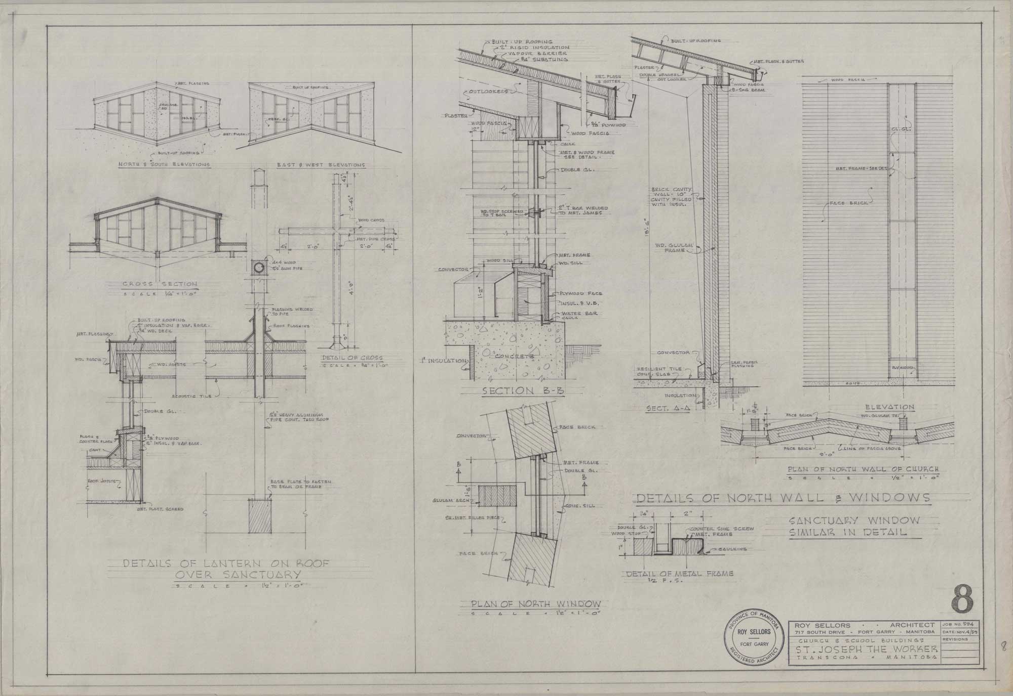
Large windows line the east face of the projecting hall. Clerestory windows lining the southern elevation bear distinct rectangular grilles in alternating sizes. Tall glass panes are set against the double door entrance, transitioning smoothly into the clerestory windows. Meanwhile, the north face has long, thin windows situated at the peaks of zigzagging walls. The eastern elevation showcases large stained-glass panels moving upwards to the roofline. The glass is overlain with metal frames positioned in a repeating triangular pattern, dramatising the modest roofline.

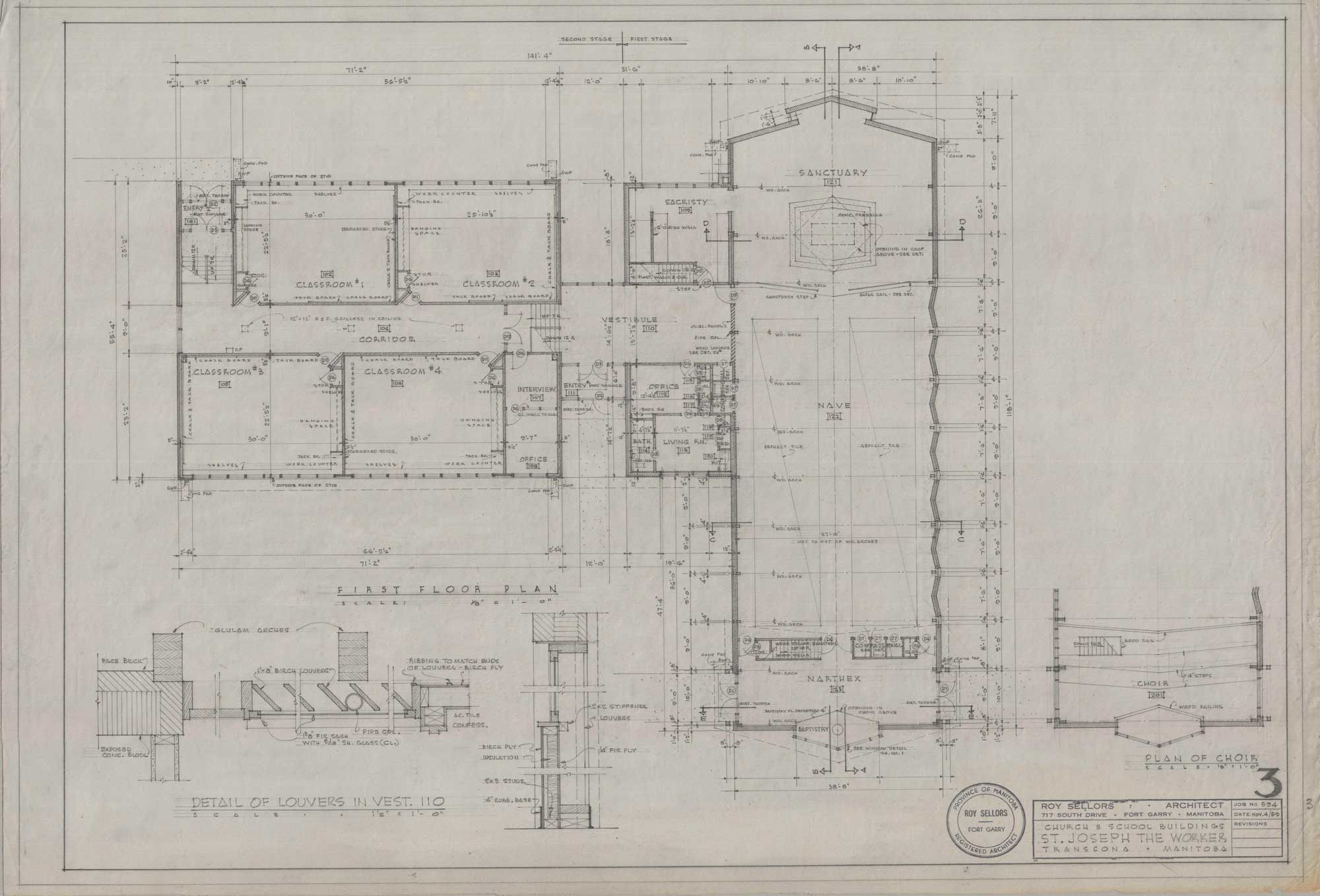
The interior of the church reflects a balanced interplay between form and light. The church is organised according to a traditional longitudinal format, with ample space for the procession. The walls are finished with dark red brick, and wood arches are placed throughout the space. Arches begin at the narthex, proceed into the nave, and end at the sanctuary. The procession of the arches from the narthex into the sanctuary brings together traditionally separate spaces and creates an impression of unity. Unlike in Sellors’s earlier work, the arches are not curved. Instead, the angular arches are flush against the brick wall, building upon the theme of connection. While the amber arches complement the dark brick, they contrast dramatically against the white ceiling. The sharpness of the arches and the austere palette of the brick and wood also contrast against the light streaming into the nave. Since the windows are placed directly to the right of the nave’s arches, the light bounces against the dark wood before settling in the hall.

The sanctuary, pulpit, and altar are placed on an elevated platform and contained by an altar rail. The sanctuary is set against a brick wall. A lighter coloured brick with distinct coursing is positioned in a triangular recessed wall. Tall and thin windows on either side of the recessed wall help relieve the austerity of the brick and frame the altar in a column of light. As the brick is illuminated by the light, it creates contrasting shadows that accentuate the repetitive and striking coursing. More provisions for natural light are made through the addition of the skylight positioned directly above the altar. Such abundant and thoughtful pathways for light literally and figuratively affirm the sanctuary’s spiritual value.

Image shows the brown brick exterior of St. Joseph the Worker Church. It has a large window at the centre and a series of white and triangular grilles.
505 Brewster Avenue, St. Joseph the Worker Church
Image shows detailed drawings of east elevation, site plan, and confessional for St. Joseph the Worker.
“Large Window – East Elevation – Confessional (Church and School Buildings, St. Joseph the Worker, Transcona, Manitoba, November 4, 1959).” Sheet 1. Roll 594 St. Joseph the Worker.
Image shows drawing of the main floor plan for St. Joseph the Worker.
“First Floor Plan (Church and School Buildings, St. Joseph the Worker, Transcona, Manitoba, November 4, 1959).” Unnumbered. Roll 594 St. Joseph the Worker.
Image shows drawing for the north and south elevations for St. Joseph the Worker Church, as well as the cross section.
“South Church Elevation – North Church Elevation – Longitudinal Section A.A. – Longitudinal Section B.B. – Cross Section C.C. – Cross Section D.D. – Cross Section E.E. (Church and School Buildings, St. Joseph the Worker, Transcona, Manitoba, November 4, 1959).” Sheet 4. Roll 594 St. Joseph the Worker.
Image shows drawings of details of the lantern on the roof over the sanctuary, the plan of the north window, and the details of the north wall and windows for St. Joseph the Worker Church.
“Details of North Wall and Windows (Church and School Buildings, St. Joseph the Worker, Transcona, Manitoba, November 4, 1959).” Sheet 8. Roll 594 St. Joseph the Worker.
Image shows drawing for the ground and upper level plan for St. Joseph the Worker Church.
“Ground and Upper-Level Plan (Church and School Buildings, St. Joseph the Worker, Transcona, Manitoba, September 1959).” Unnumbered. Roll 594 St. Joseph the Worker.
Image shows drawing of exterior for St. Joseph the Worker Church. Trees frame the church.
“[Perspective of St. Joseph the Worker] (Church and School Buildings, St. Joseph the Worker, Transcona, Manitoba, September 14, 1959).” Unnumbered. Roll 594 St. Joseph the Worker.

St. Bernadette Parish Centre

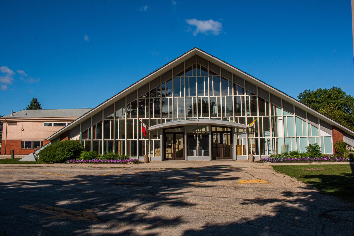
St. Bernadette Parish Centre, built in 1961, brings together innovative forms and light to create a striking church. It exemplifies the potential of modernist architecture to create new sites of worship.
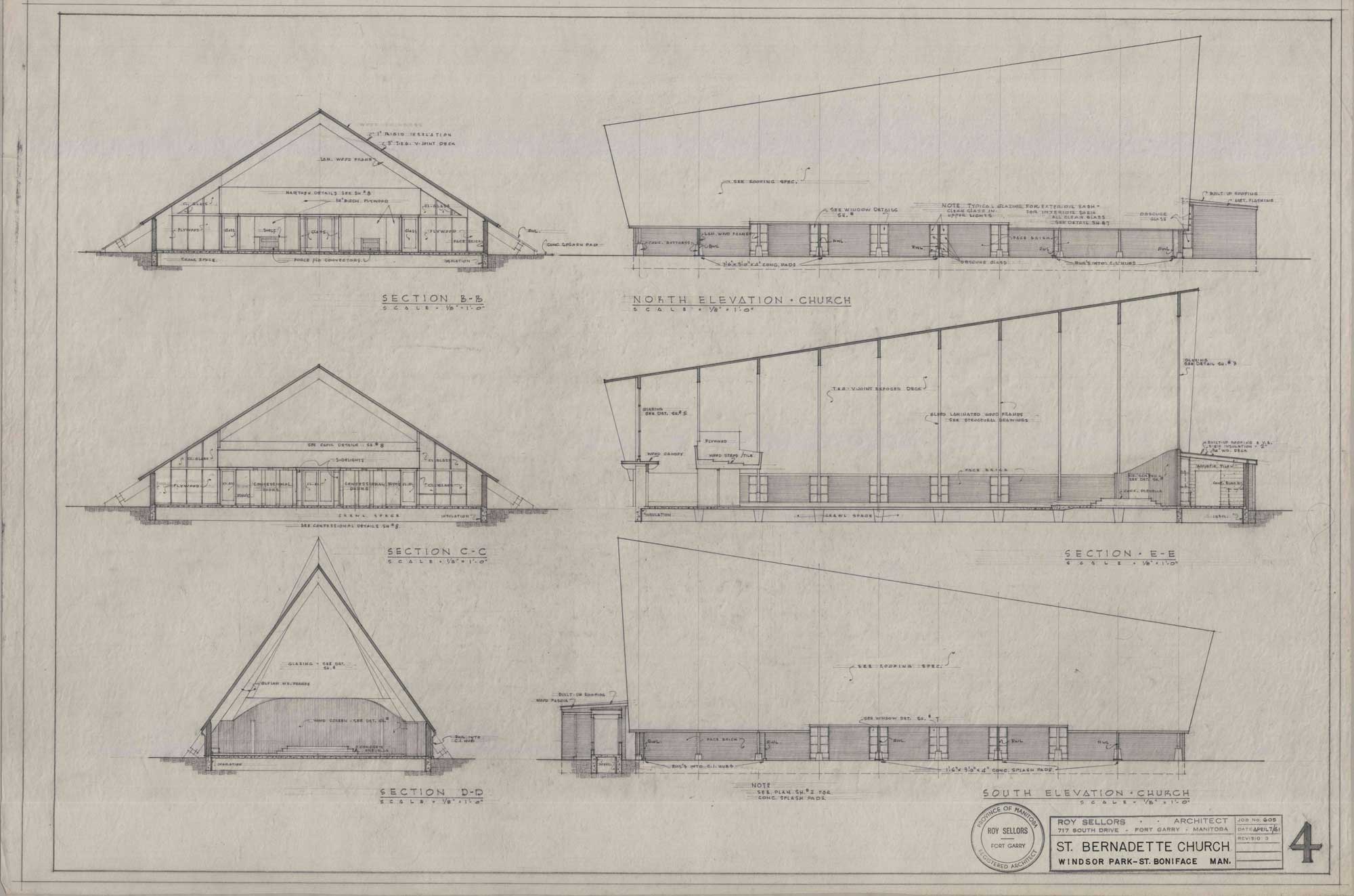
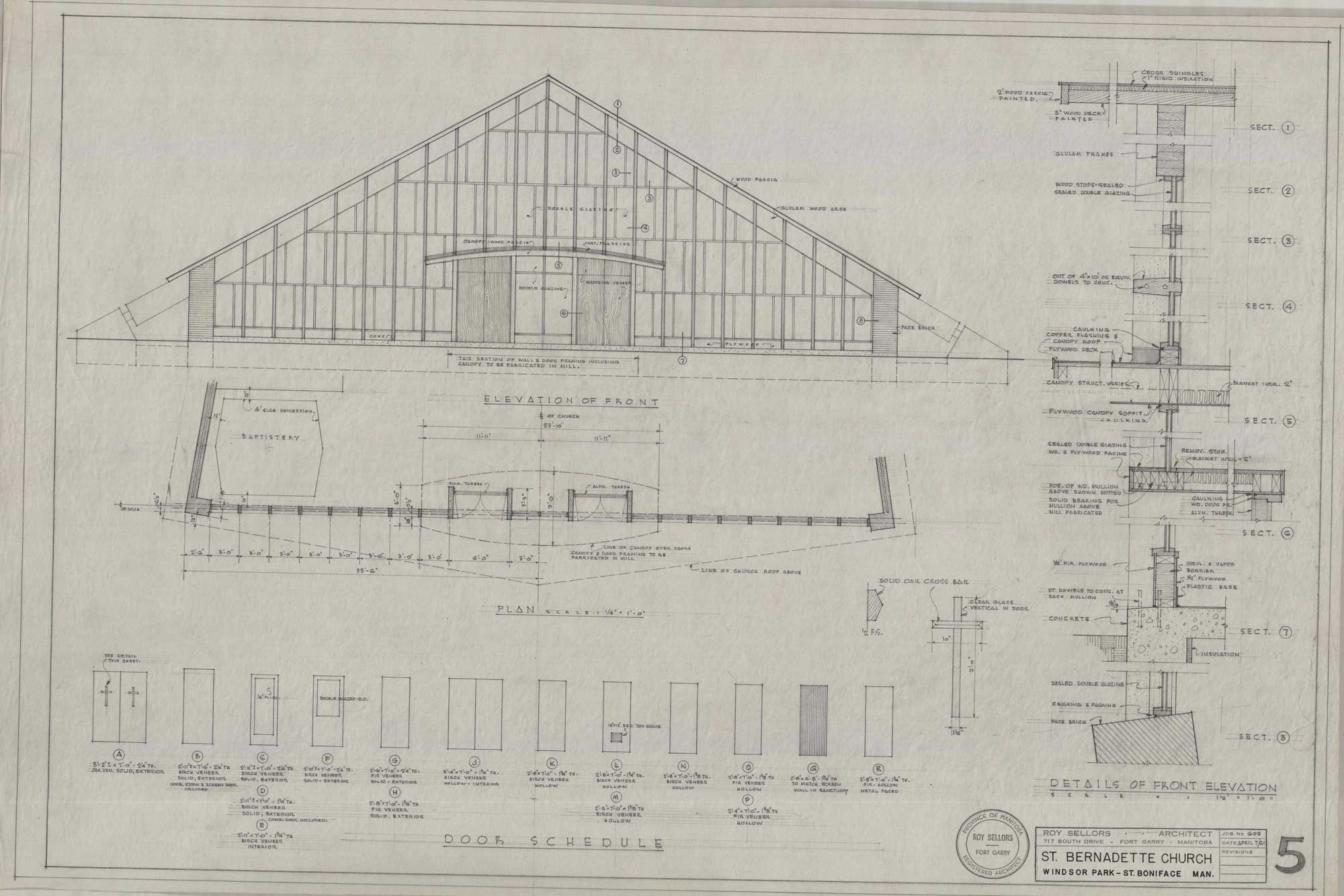
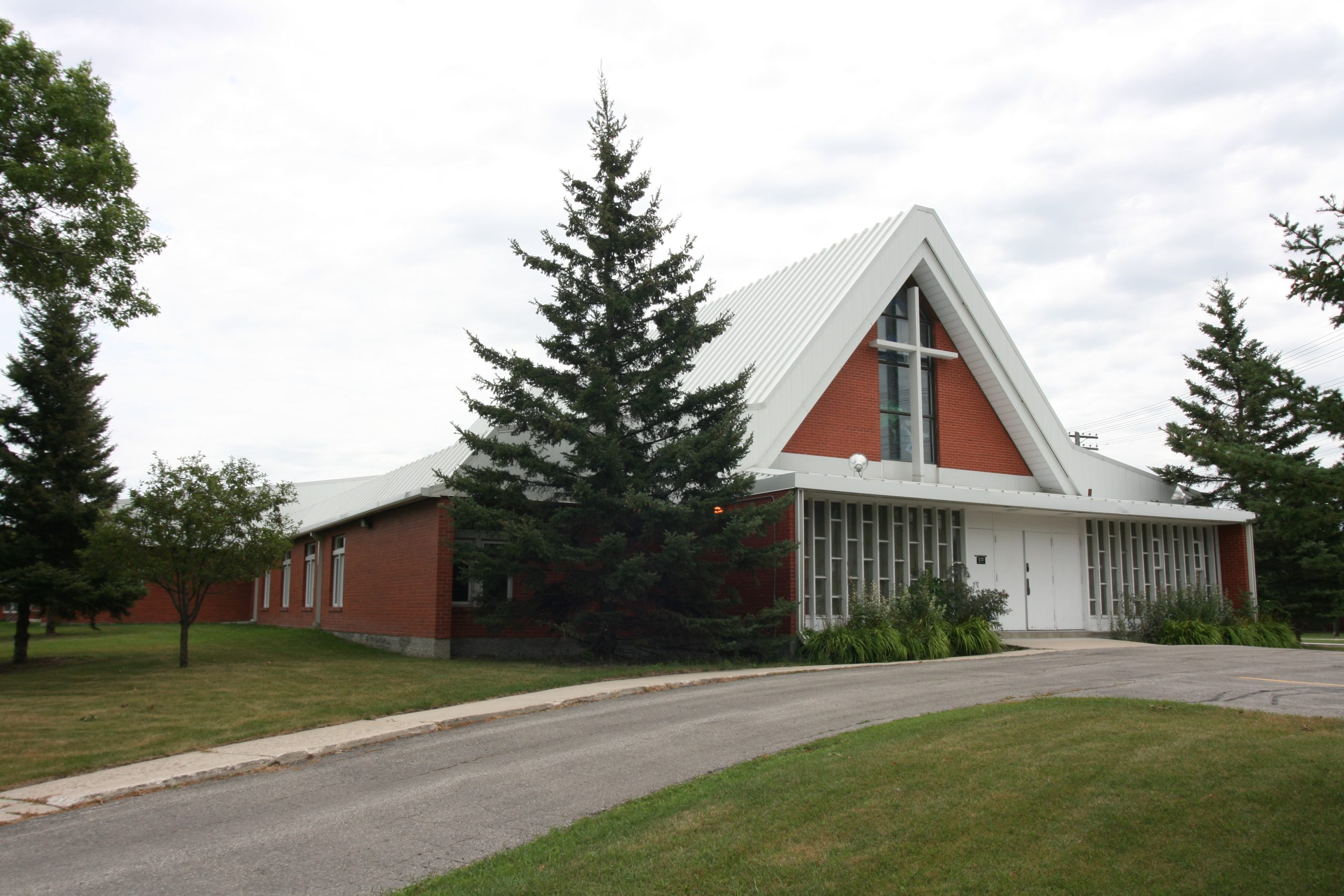
As demonstrated by his earlier designs, Sellors was interested in creating monumentality and mass with dramatic forms. He previously accomplished this by placing steep rooflines atop rectangular structures. For St. Bernadette, the roofline's laminated wood beams instead drive into the ground at sharp angles on the east elevation to create a distinctive triangular frame. Its concrete foundation is raised above grade and calls attention to the row of anchors along the north and south sides of the building.

Other elements build on this arresting monumentality. With a low and wide east facade rising to the tall and slender west elevation, the church appears to rise from the flat landscape. The bowed and curving roof is clad with cedar shingles. Its eaves extend generously, resembling a monk's cowl slipping onto their shoulders. A wood canopy shelters the double door and eastern entrance.

While the building's structural composition more subtly hints at the religious nature of the space, the creative application of light clearly communicates the space as a spiritual site. St. Bernadette’s appearance is characterised by glass fixtures. The east and west elevations have entirely glass facades. On the east facing windows, there are a series of overlapping partitions. The metal partitions extend slightly forward, creating liveliness through the shifting shadows. On the west windows, the Holy Trinity is beautifully displayed through stained glass artwork. An emerald bird on the lower right represents the Holy Spirit. A cobalt blue animal on the lower left represents the Lion of the Apocalypse. A statue of Jesus Christ stands at the top with outstretched arms.

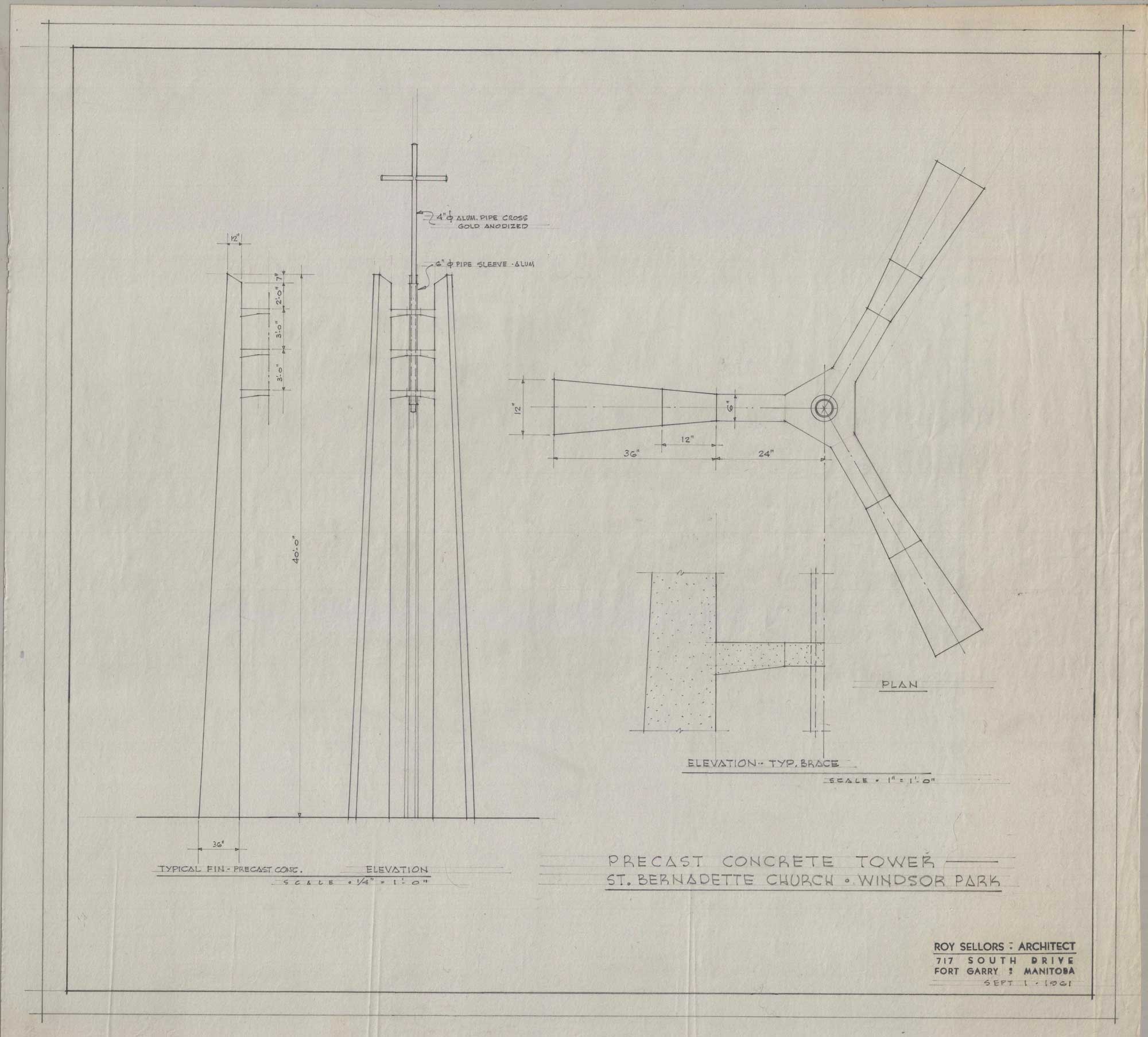
A precast concrete tower stands on the east side. The minimalist cross is finished in gold and is supported by three horizontal support braces.

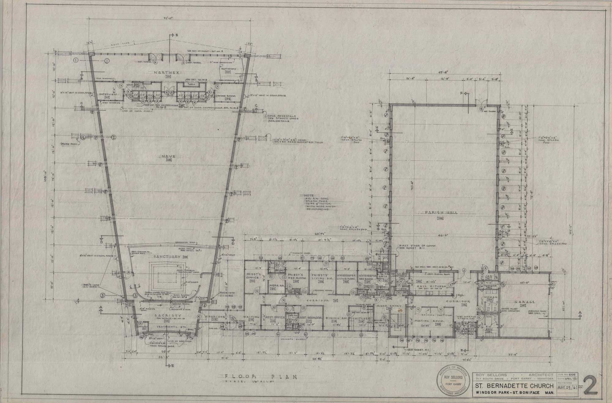
Sellors draws upon the traditional elements of the longitudinal basilican plan. The narthex is separated from the nave. The Eucharistic rites' centrality is expressed through the nave. In contrast to the uniform halls of his earliest work, the nave narrows gradually as it approaches the sanctuary. The spiritual importance of the sanctuary and the altar are demonstrated by their elevated position on a concrete predella and the teakwood screen that serves as its backdrop. The six ton, black granite altar faces the parishioners.

The church's interior has a striking clarity. The brick walls are simple, mainly functioning as a grounding element for the extraordinarily high ceilings that mirrors the exterior's triangular form. The ceilings are finished in laminated dark wood that clothes the space in a warm and amber tone. Streamlined wood arches are arranged throughout the nave and settle into the sanctuary, coming to a point that reinforces the height and triangularity of the church. Visitors are compelled to fix their attention towards the heavens in a shared experience of worship.
The exceptional application of light complements the arresting structural form. The central place of light in the design is made immediately clear after entering the narthex, which is flooded with light from the eastern windows. Small northern and southern glazed windows placed at grade bring light directly into the nave. Since the arches drive into the centre of the windows, light diffuses softly on its teakwood bases. The most prominent fixture of light is the stained glass window on the western elevation, coming as high as the ceiling. The light shines against the wood ceiling, contrasting against the dark panelling. Meanwhile, the nave is illuminated by multicoloured patches of light.

Image shows a dramatic triangular frame with glass windows from the floor to the ceiling. There are sets of white rectangular grilles spanning across the exterior.
820 Cottonwood Road, St. Bernadette Parish Centre
Image shows drawing of the main floor plan for St. Bernadette Church. The drawing shows the nave and the parish hall, as well as technical details.
“Floor Plan (St. Bernadette Church, Windsor Park, St. Boniface, Manitoba, May 21, 1961).” Sheet 2. Roll 605 St. Bernadette Church.
Image shows drawings of the north and south elevations for St. Bernadette Church. It shows the interior of the north and south sides of the church.
“North Elevation – South Elevation – Section B.B. – Section C.C. – Section D.D. (St. Bernadette Church, Windsor Park, St. Boniface, Manitoba, April 7, 1961).” Sheet 4. Roll 605 St. Bernadette Church.
Image shows the drawing of the front elevation for St. Bernadette Church.
“Elevation of Front – Details of Front Elevation – Door Schedule (St. Bernadette Church, Windsor Park, St. Boniface, Manitoba, April 7, 1961).” Sheet 5. Roll 605 St. Bernadette Church.
Image shows drawing of St. Bernadette Church's precast concrete tower. A minimalist cross is suspended on concrete beams.
“Precast Concrete Tower (St. Bernadette Church, Windsor Park, St. Boniface, Manitoba, September 1, 1961).” Unnumbered. Roll 605 St. Bernadette Church.

Our Lady of Perpetual Help Roman Catholic Church

Our Lady of Perpetual Help was first erected on a three-acre lot in 1947. But as the number of parishioners grew, plans to relocate from the modest sized church began to take shape. Plans started in 1951. By 1963, the church was built and started holding services. The design of the church went through a series of changes before the building was completed. While Sellors' final design varies dramatically from his earlier renderings, he ensures that the church uses structural form and light in an innovative manner.

Image shows a brick church with white panelled roofs. A window sits at the centre of the roof.
4588 Roblin Boulevard, Our Lady of Perpetual Help Roman Catholic Church
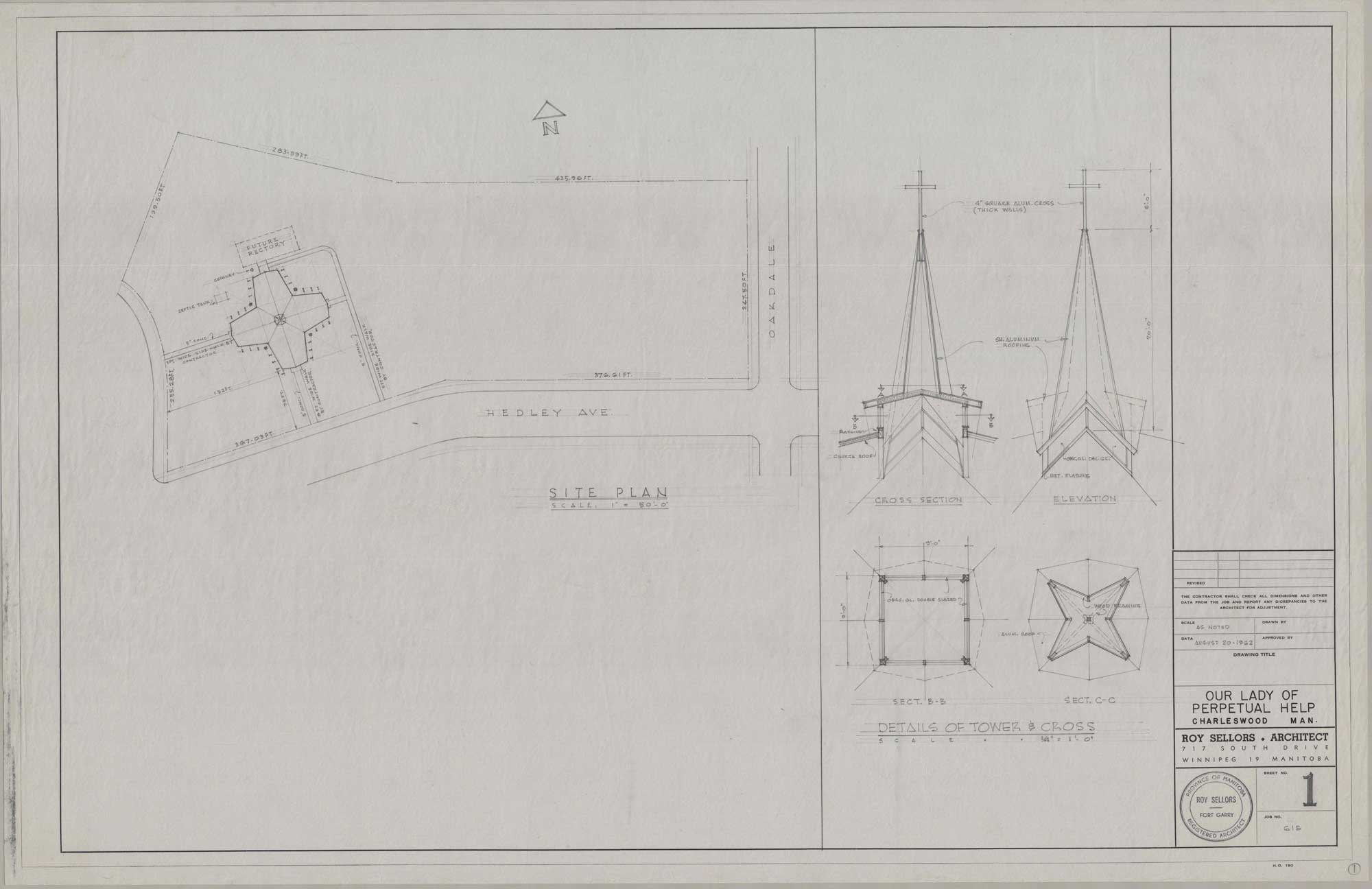
“Site Plan – Details of Tower and Cross (Our Lady of Perpetual Help, Charleswood, Manitoba, August 20, 1962).” Sheet 1. Roll 615 Our Lady of Perpetual Help.
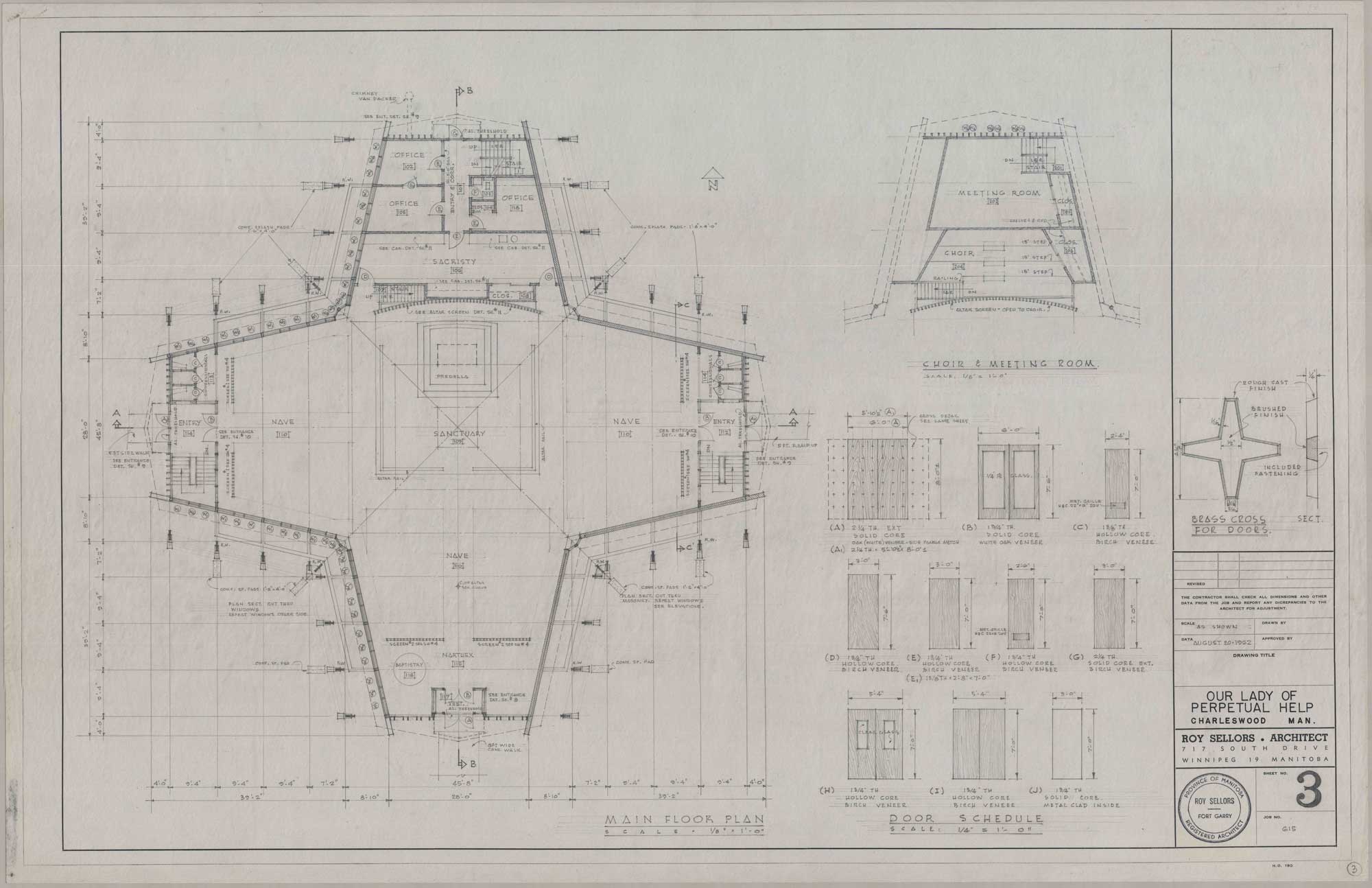
“Main Floor Plan – Choir and Meeting Room – Door Schedule (Our Lady of Perpetual Help, Charleswood, Manitoba, August 20, 1962).” Sheet 3. Roll 615 Our Lady of Perpetual Help.

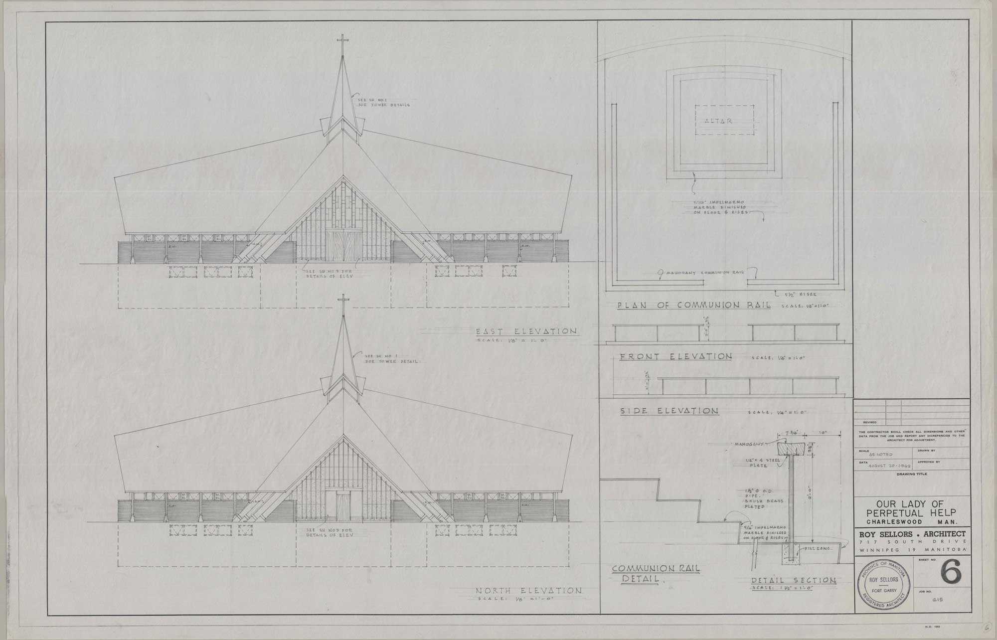
Sellors' initial plan echoes the dramatic and tall frame that characterises his earlier designs. The cruciform plan features a pitched gable roof that peaked prominently at the structure's centre before descending to a dramatic point at the four cardinal directions. As it moves toward the entrances, the roofline forms an arresting triangular frame. The entrances have laminated wood beams that drive directly into the ground to further illustrate the striking form and contrast the elevations' sharpness with the curved roof. The roof dominates the facade in an impressive display of mass. Combined, the structural elements come together to create a complex and dynamic church consistently extending upward.

The structure's triangular frame and apparent ascension is reaffirmed by the addition of a tall and thin tower on the western elevation. A cross is fixed atop the tower as a clear and simple indication of the building's religious status. Religious symbolism is more subtly reflected through the triangular tower and its slightly extending eaves. The shape echoes Roman Catholic priests' traditional headwear.

Light and spaciousness are critical considerations in earlier sketches. They complement the dramatic frame of the church and alleviate the intensity of the mass. Natural light enters the space through two main pathways. Clerestory windows allow light to float downwards into the nave. Their subtle position between the heavy brick walls and the sweeping roof mitigated the severity of the material and made the roof appear to be floating. Glass walls on the east and north elevation flood the narthex in light. The glazed glass rises as high as the arches. Rectangular and metal partitions sit above the glass to help lengthen the entrances.

Sellors' initial floor plans resembled traditional cruciform church plans. The sanctuary was bound by an altar rail. The altar was placed on a concrete predella. Set as the prime focus of the space, the sanctuary and the altar were bound by naves from the west, east, and south. While the sketch clearly drew inspiration from earlier church construction, it deviated from traditional layouts because the naves expanded as they approached the sanctuary.

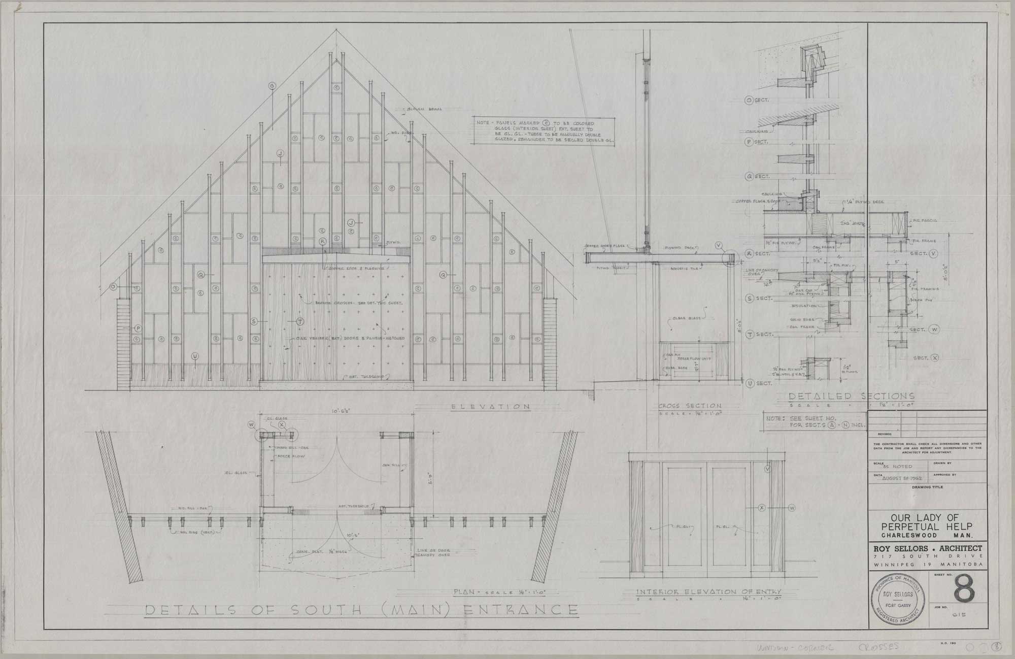
“Details of South (Main) Entrance (Our Lady of Perpetual Help, Charleswood, Manitoba, August 20, 1962).” Roy Sellors fonds. Sheet 8. Roll 615 Our Lady of Perpetual Help.
“East Elevation – North Elevation – Front Elevation – Side Elevation (Our Lady of Perpetual Help, Charleswood, Manitoba, August 20, 1962).” Sheet 6. Roll 615 Our Lady of Perpetual Help.
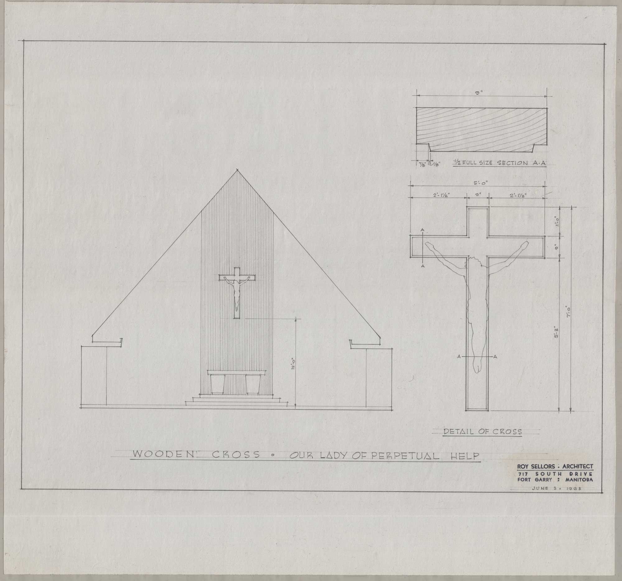
“Wooden Cross – Detail of Cross (Our Lady of Perpetual Help, Charleswood, Manitoba, September 12, 1962).” Roll 615 Our Lady of Perpetual Help.

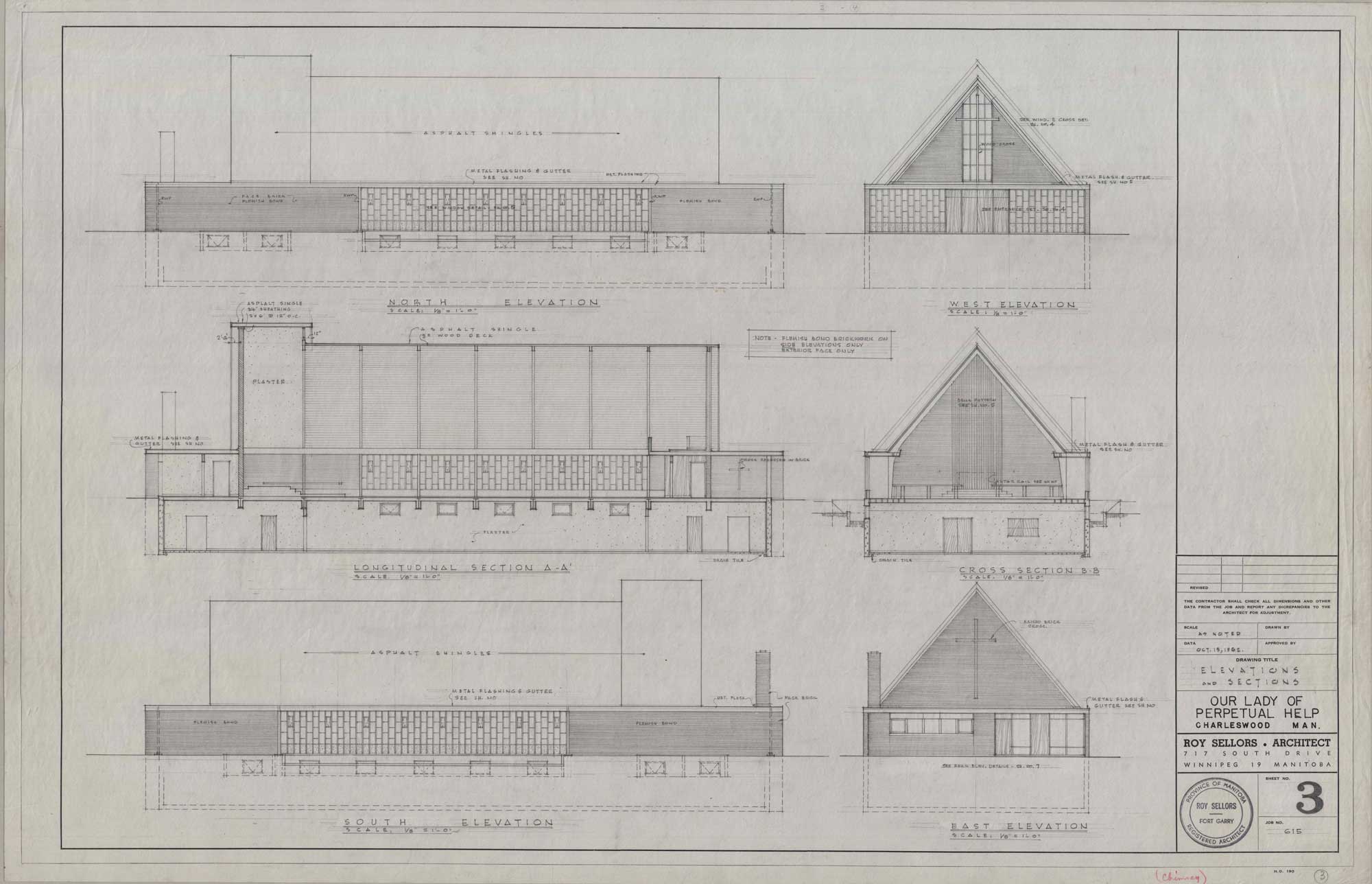
By the fall of 1962, Sellors made profound changes to the church's design. Although the final plans are simpler, they continue to use streamlined forms and an abundance of light. Later designs show a simple rectangular structure with a distinctive and tall gable roof. The roofline's triangular steepness is accentuated by its placement over a flat roofline with extending gutters. Its steepness echoes earlier attempts to build a striking monumentalism through height.

Image shows drawings of the north, west, east, and south elevation. The sketch shows the interior of the nave.
“Elevations and Sections (Our Lady of Perpetual Help, Charleswood, Manitoba, October 15, 1962).” Roll 615 Our Lady of Perpetual Help.
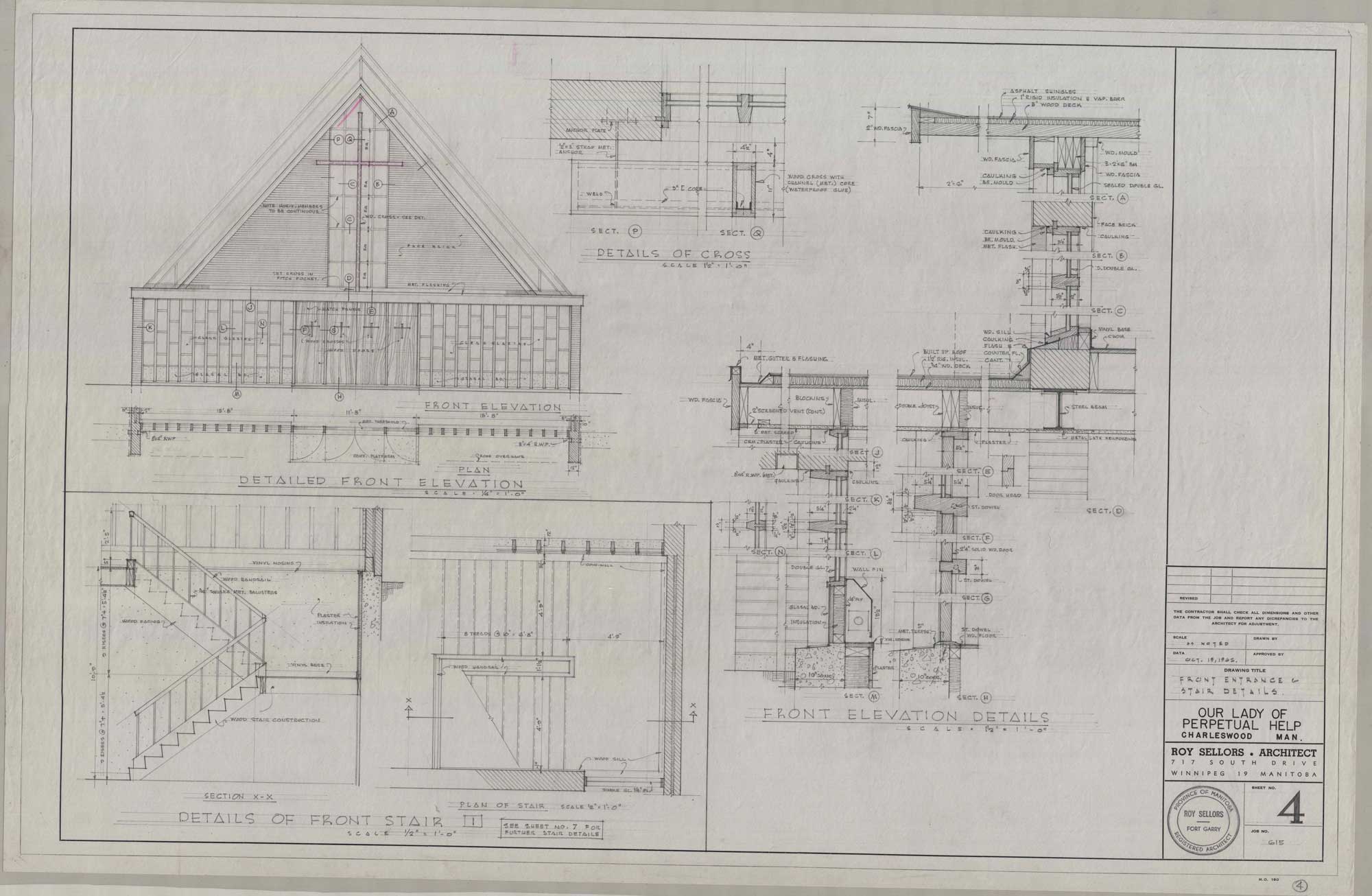
Image shows detailed sketches of the front elevation and the front staircase.
“Front Entrance and Stair Details (Our Lady of Perpetual Help, Charleswood, Manitoba, October 15, 1962).” Roll 615 Our Lady of Perpetual Help.

The attention to light is clearly expressed through the expansive use of windows. Mirroring the initial drawings' walls of glass, the west elevation bears a glass wall with uniform white metal partitions. The triangular roof has a column of glass positioned prominently at the centre. The placement accentuates the tall roofline and the simple wooden cross. Walls of glass continue to stretch over the north and south elevations, allowing light to stream generously into the space.

The church has a simple, longitudinal layout. Rather than accommodating several naves and freeing the sanctuary, later sketches show a singular nave leading to a contained sanctuary and altar. The sanctuary is elevated, and the altar is placed on a concrete predella. It is set against a brick wall. To fix attention to the altar, a column as wide as the predella has distinct sawtooth brickwork.

In the absence of excessive embellishments, the brightness of the construction materials becomes a critical fixture in the design. The nave is finished with brick and laminated wood. The high ceiling is constructed with amber wood panels that flow directly into the similarly toned arches. Curved arches span from the nave to the sanctuary. Smaller arches flow from the main supports and are grounded between the windows to create an element of continuity.

Sources

“About Us.” Our Lady of Victory Memorial Church Winnipeg. Accessed February 2023. https://www.ourladyofvictoryywg.com/.

Christ-Janer, Albert, and Mary Mix Foley. Modern Church Architecture a Guide to the Form and Spirit of 20th Century Religious Buildings. New York: Dodge Book Dept., McGraw-Hill, 1962.

Roy Sellors fonds. Winnipeg Architecture Foundation Archives, Winnipeg, Manitoba.

Price, Jay M. Temples for a Modern God: Religious Architecture in Postwar America. Oxford: Oxford University Press, Incorporated, 2012.

Proctor, Robert. “Churches for a Changing Liturgy: Gillespie, Kidd & Coia and the Second Vatican Council.” Architectural history 48 (2005): 291–322.

“The Story of St. Vital Parish in Fort Garry.” St. Vital Parish Church. January 2014. Accessed February 2023. https://www.stvitalparish.ca/parish-history.

Keshavjee, Serena, and Herbert Enns. Winnipeg Modern: Architecture, 1945 to 1975. Winnipeg: University of Manitoba Press, 2014.

About the Roy Sellors Fonds

All architectural drawings in this exhibit were sourced from the Winnipeg Architecture Foundation's Roy Sellors fonds. Donated by John Sellors, the Roy Sellors fonds consists of approximately 1200 architectural drawings related to Sellors' architectural practice.

More information about the fonds can be found through the Manitoba Archival Information Network. The Finding Aid was prepared by archivist Ian Keenan. The digitization of the drawing was funded by the Documentary Heritage Communities Program, Library and Archives Canada.