Notre Dame Entry, Plaza and Mall Levels, Red River College
| Address: | 2055 Notre Dame Avenue |
|---|---|
| Constructed: | 1968-70 |
| Architects: | |
| Firms: | |
| Engineers: |
|
| Contractors: |
More Information
Beginning in 1968, the size of the Notre Dame campus of what was to become Red River College more than doubled over a two year period. At this time, in addition to the extant Manitoba Institute of Technology (MIT) buildings were added the suite of buildings designed to house the Manitoba Institute of Applied Arts (MIAA), a centre which complimented the technological institute with a host of new courses. At the same time an central administration tower, power house and gym were added, all shared by the two institutes. To connect the various structures new and old (and to create a cohesive campus) a campus entryway, underground circulation space and exterior plazas were built. The firm hired for all the new additions was Libling Michener, of Winnipeg, which possessed a track-record of cutting edge modernist work – often with a Brutalist slant. The construction firm employed was Bird Construction.
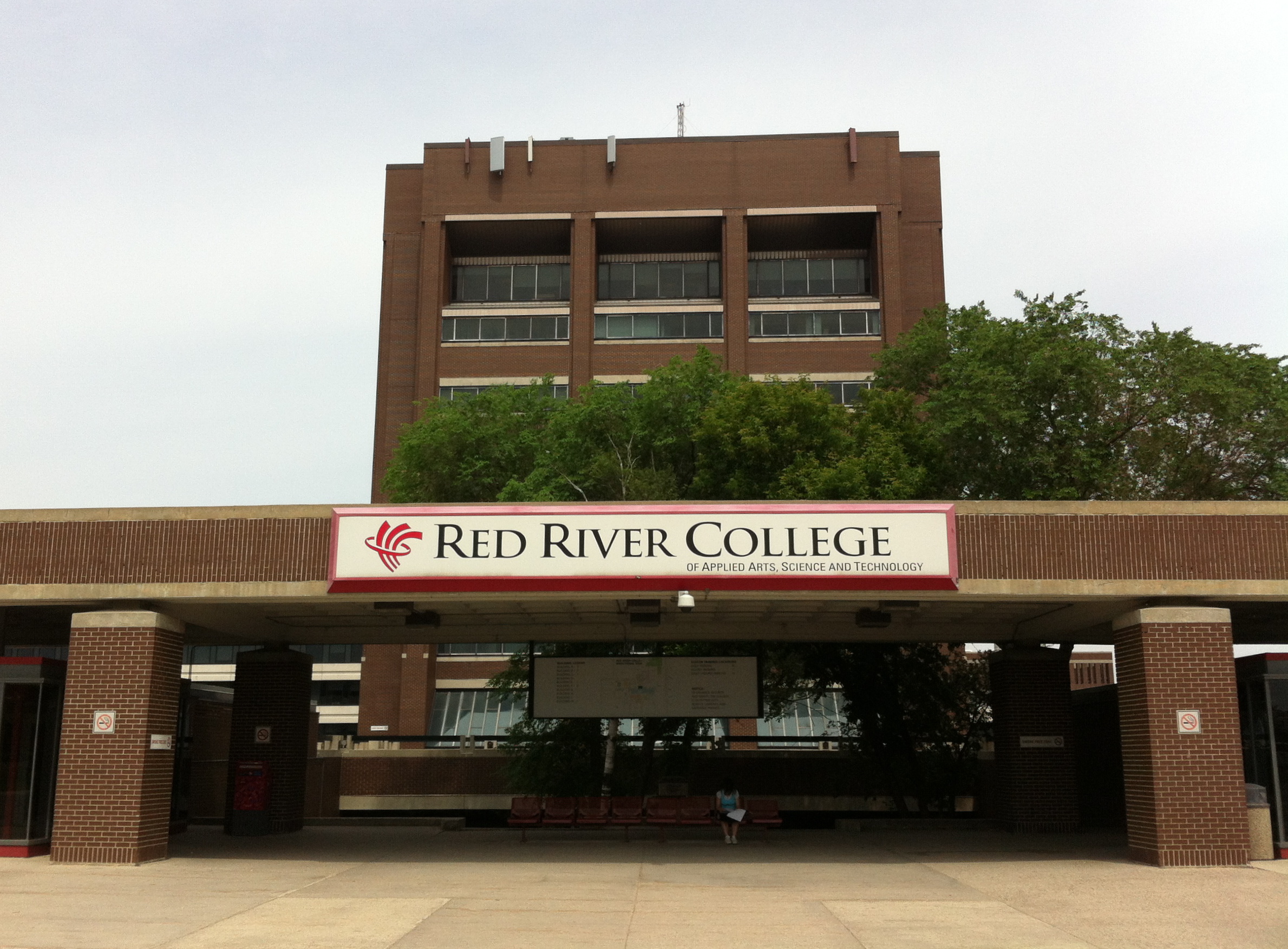
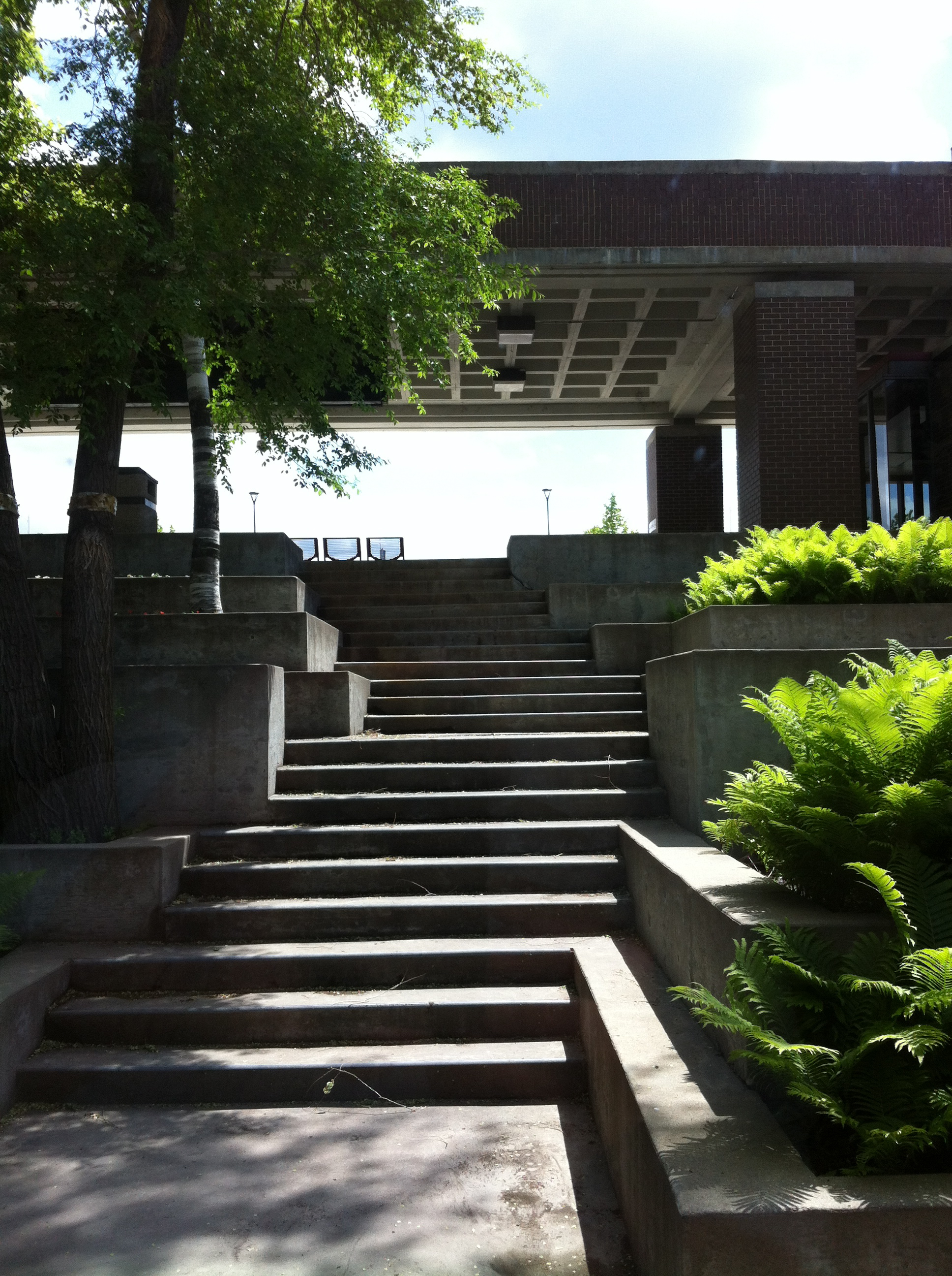
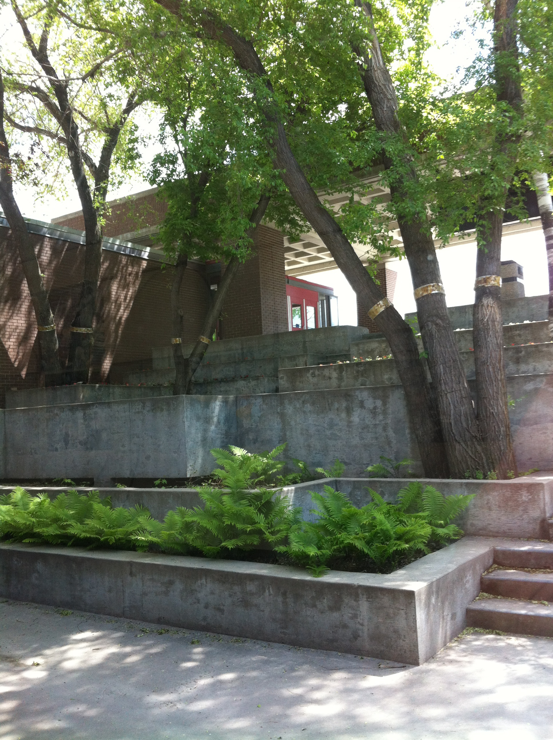
Emphasizing a general quality of symmetry between the old MIT and the new MIAA, the architects created a prominent, south-facing, gateway in the middle of the two sets of structures. The new entrance was in a north-south line with the campus’s new tall administration building, Building C, creating an axial centre. Matching parts of the MIT buildings, much of the new construction featured dark brown brick with lighter cream concrete accents. The new monumental portal was among the structures executed in this way; it features a heavy, brick-faced canopy (enclosing a “waffle” style concrete slab ceiling) held aloft by four similar heavy, brick-faced columns. A slight gap separates these two elements, lending the heavy roof a feeling of buoyancy. At centre, behind this entryway, lies a sunken garden featuring stepped and sculpturally intricate concrete planters and stairs. This element bridges the above-ground exterior space with the below-grade interior. In the summer, this space supports cascading ferns and shade-trees; the overall composition conveys a sort of “Gardens of Babylon” effect. A closer parallel is Arthur Erickson and Cornerlia Oberlander‘s design for the roof and gardens of Vancouver’s 1972 B.C. Provincial Courthouse, as well as M. Paul Freidberg’s Peavey Plaza in Minneapolis. Original plans called for a large fountain southward across the bus-loop from the main entrance.
Flanking this entry are two glazed sections which lead to parallel downward staircases, in-line with the subterranean “mall level.” At the time of the addition of MIAA and the other new structures. It was a priority of the architects to carefully integrate the disparate elements of the campus. At the same time, Leslie Stechesen director of design for this Libling Michener project stated that the firm’s work strove for a “sense of smaller colleges within the whole,” with each of the extant seven interlinking buildings somewhat maintaining a unique identity. To achieve these disparate aims, they decided to create a two-fold circulation plan, connecting nearly all the buildings with the an underground “mall” level and, above, keeping a sense of separateness by means of the an open-air plaza. This effort established the campus as a sort of megastructure, a form common to this time period. Connecting these two areas – the indoors and outdoors – are multiple sunken exterior courtyards, lower-level windows and skylights. At the time, much was made of the innovation of the linking of the various facilities by a climate-controlled pedestrian system, and its granting of quick and comfortable movement. This character somewhat connects the scheme to the idea of the “megastructure,” a term given currency during this era by the work of the British architectural theorist Reyner Banham. Notably, Stechesen later was responsible for a similarly linked, indoor, system to host the town centre of Leaf Rapids, Manitoba.
At the Notre Dame campus, this lower level also houses food services, library and student services store, a computer centre (dating back to the original construction) and television and lecture theatres. At the intersection of the corridors were, initially, sculpted masonry conversation areas, intended as sites for students to meet and chat. One aim for this seating was to provide for casual or formal teaching sessions. In general, one goal of the architects’ goals was to create passive and active recreational areas across the whole site, an intention which involved such architectural gestures. In 1996 these were removed and replaced with planters and benches. The main student lounge on this level originally featured brown brick conversation pits and orange carpeting. As it was put by contemporary journalists, the “first reaction of a visitor to the new college is one of pleasure. Without doubt it is beautiful, with walls of textured plaster and brown brick, accented by orange carpeting” to “provide a warm and inviting atmosphere.” The initial plan also involved color-keyed doors to identify the various buildings and “add another touch of brightness.”
Though the plans for the exterior plaza level initially called for a great deal of planting, this intention has largely thus far not been met. Some memorable character is granted to this space by means of the decorative effect of the symmetrically placed skylights, which appear almost as sculptures. Another notable detail are the heavy, modernist balustrades which are placed throughout the plaza level, lending a certain sense of formality and classicism.
Design Characteristics
| Materials: | brick, concrete |
|---|
- “Waffle” concrete slab roof
- Brick facing
Links & Related Places
- Building C, Red River College, 2055 Notre Dame Avenue
- Buildings D, E & F, Red River College, 2055 Notre Dame Avenue
- North Gym and Power House, Buildings G & H, Red River College, 2055 Notre Dame Avenue
- LM Architectural Group
- Bird Construction
- Leslie Stechesen


